This section showcases my design thinking philosophy, approach, and UX techniques I often employ in projects prior to creating high-fidelity UI screens. Depending on project objectives, I may emphasize some methods over others. Below are sample process artifacts I have created based on my client projects. I enjoy these exercises equally as much as creative and visual UI design, as it enables me to tap into my "logical" side.
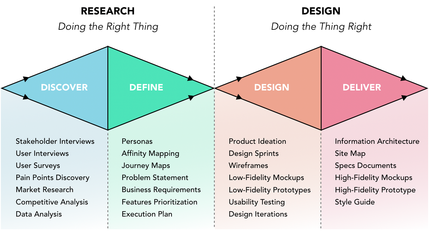
This is my version of the Design Thinking Double Diamond - the 4Ds: Discover, Define, Design, and Deliver. First and foremost, before embarking on any project or initiative, it is important for me to ensure our efforts are put toward the right problem. Often times, after asking a few questions to clients, we uncover the underlying problem that actually needs to be solved. In the discovery and design phases, there is room for varied, diverging ideas. In the define and deliver stages, the scope becomes narrower and more focused. This process should not be taken too sequentially or literally, but instead it should be viewed in a fluid manner. Sometimes, it may make sense to begin with a quick design to test out a concept. During feedback loops, there is an opportunity to discover and define as well. As long as there is open-mindedness, collective input and collaboration, sensitivity toward end-user experience, and a willingness to iterate, the design thinking approach can be utilized successfully. This diagram I created lists some of my favorite artifacts that arise from this process. For the remainder of this section, I will be referencing my actual project artifacts.
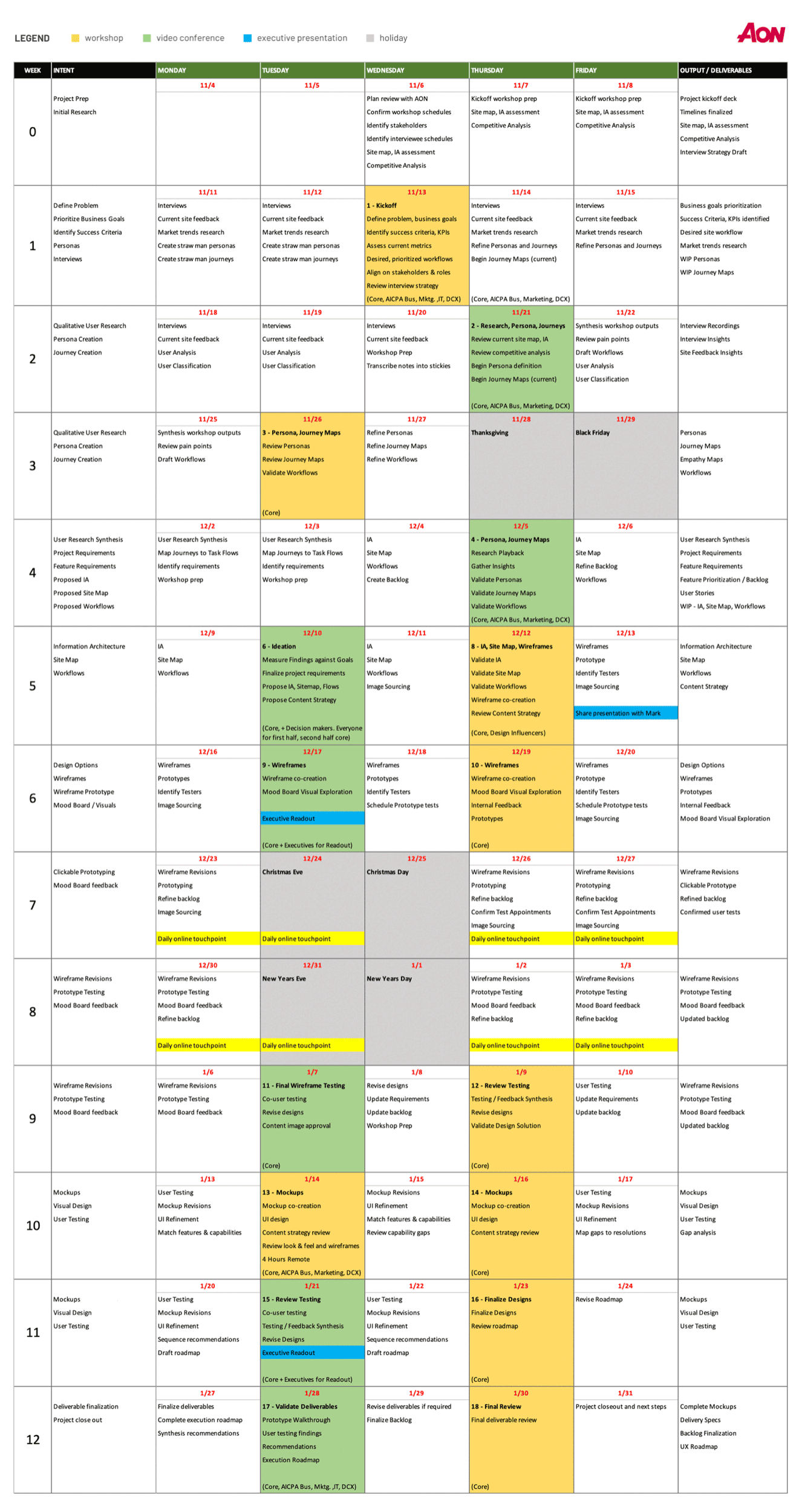
Once I have a sense of a project's requirements, I like to begin by drafting out proposed weekly agendas, as shown in my chart below. This allows me to plan for my team's daily activities and expected timeline for deliverables. It also enables me to better delineate responsibilities amongst my team members. When we encounter scheduling changes or pivots, I adjust this calendar accordingly. Clients appreciate this transparency. which gives them confidence in our execution toward deadlines.
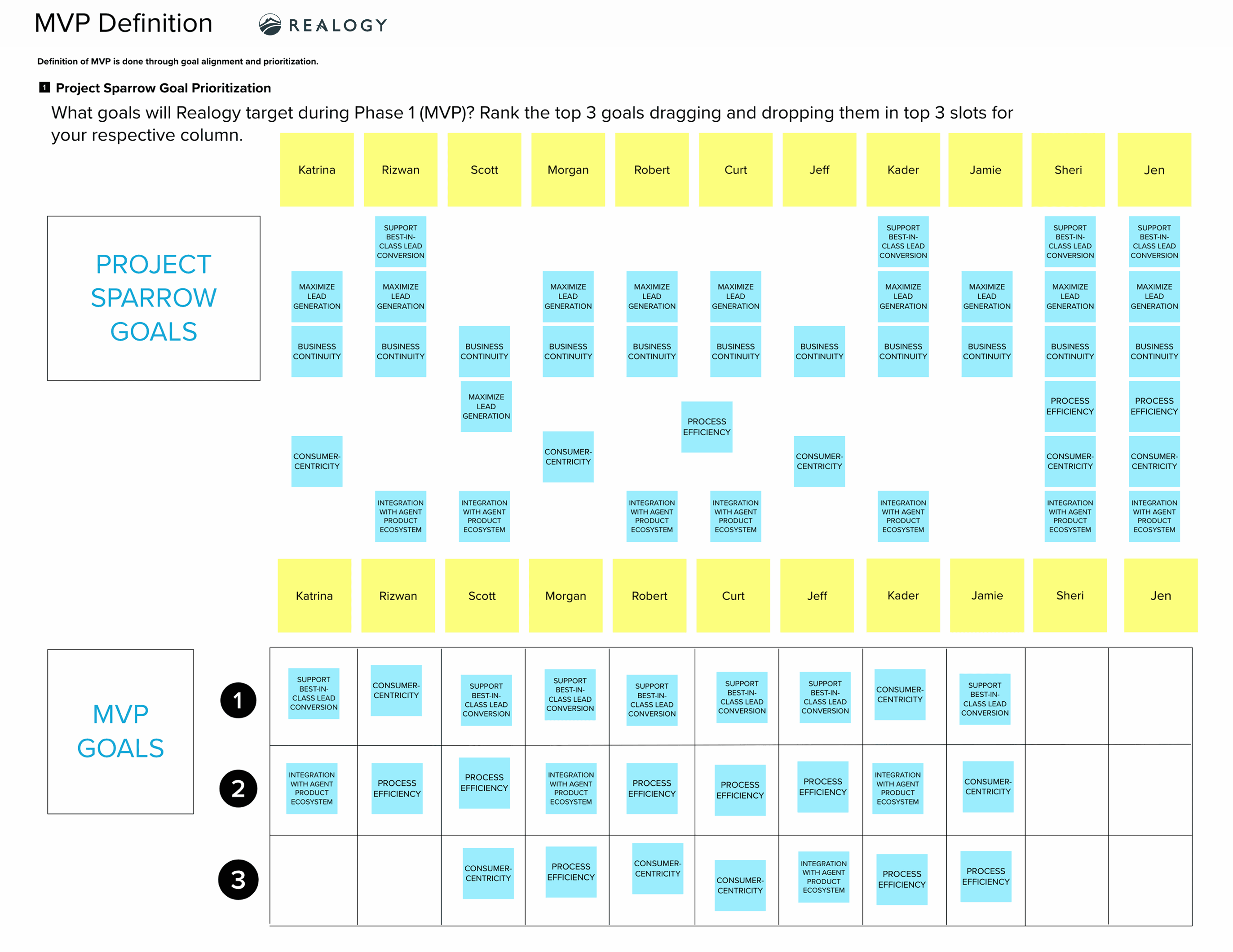
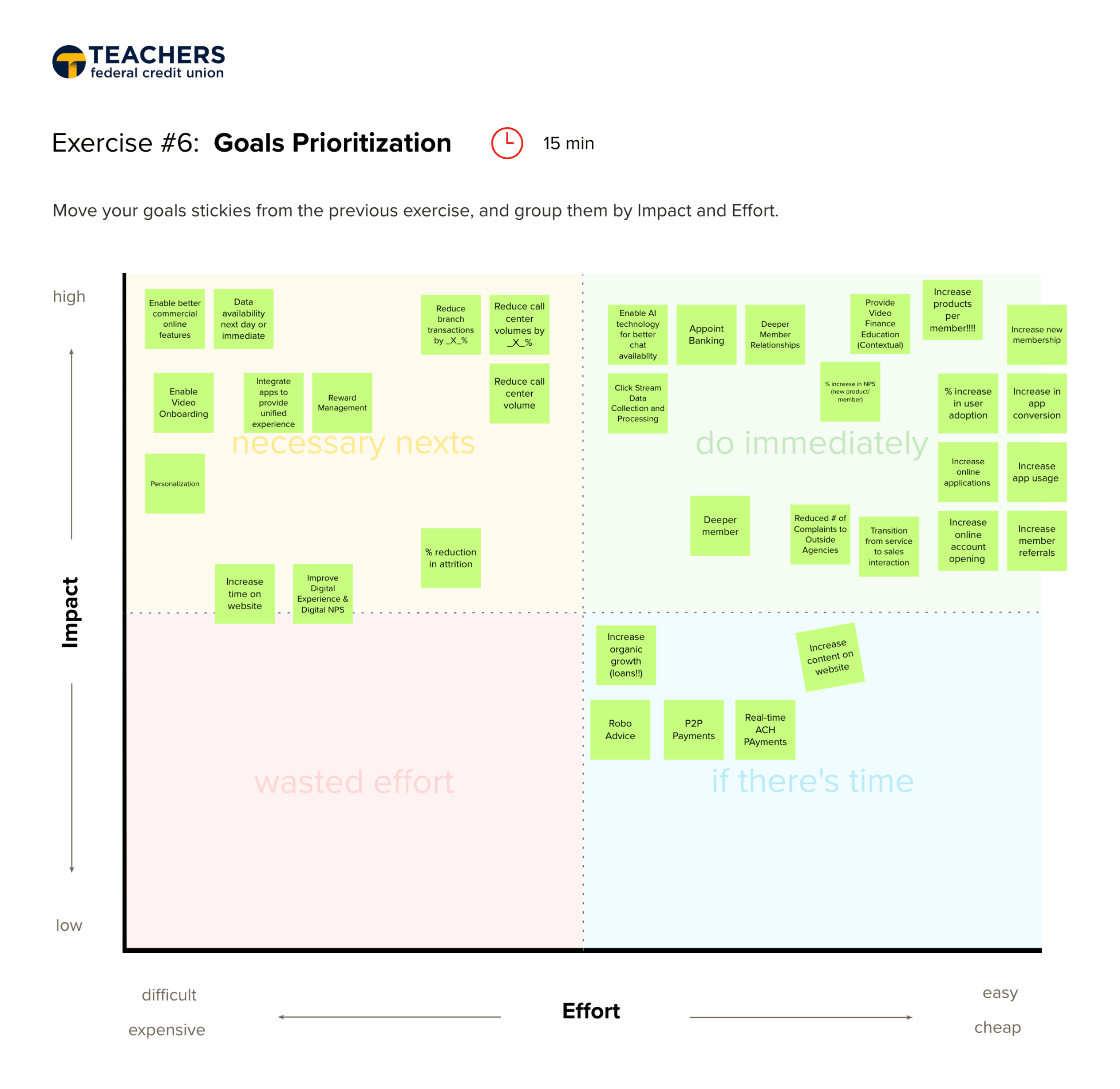
At the onset, I like meeting with all project stakeholders to hear different perspectives, and facilitate their goal alignment. Often times, stakeholders are busy and unavailable, so I try to use their time efficiently to drive their decision making and remove obstacles. Their participation in the prioritizing goals exercise enables them to discuss, challenge one another, and come to a consensus, which ensures we are proceeding in the right direction. Though many goals are brought up, I help them focus by figuring out MVP and prioritized goals based on their levels of impact and ease of execution. Non-prioritized goals are documented in a roadmap.
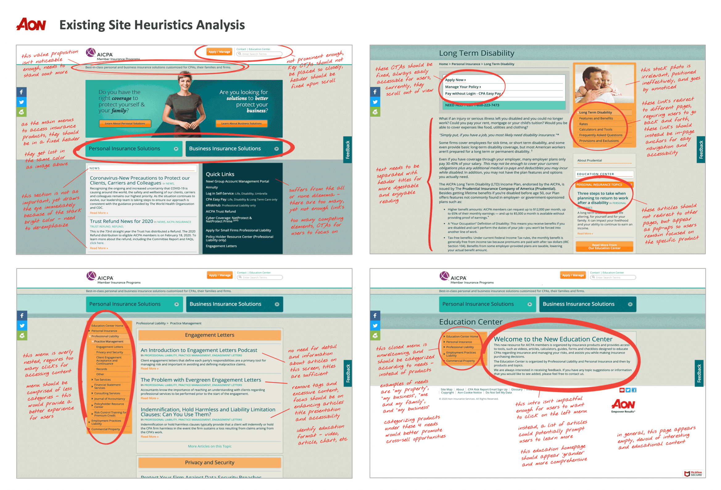
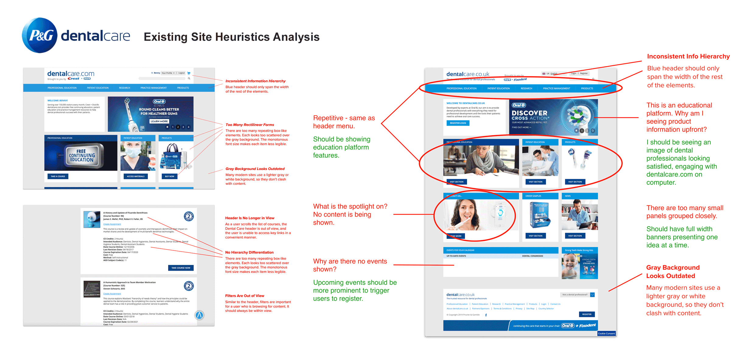
After aligning with stakeholders on prioritized goals, I now have a clear understanding of how to assess their existing websites, applications, and processes. My critique criteria is also based on UX best practices. I like making this evaluation prior to user research, as I am able to offer stakeholders my design perspective - not yet influenced by user feedback. It is also an opportunity for me to generate ideas and hypotheses that may be validated or dispelled later on.
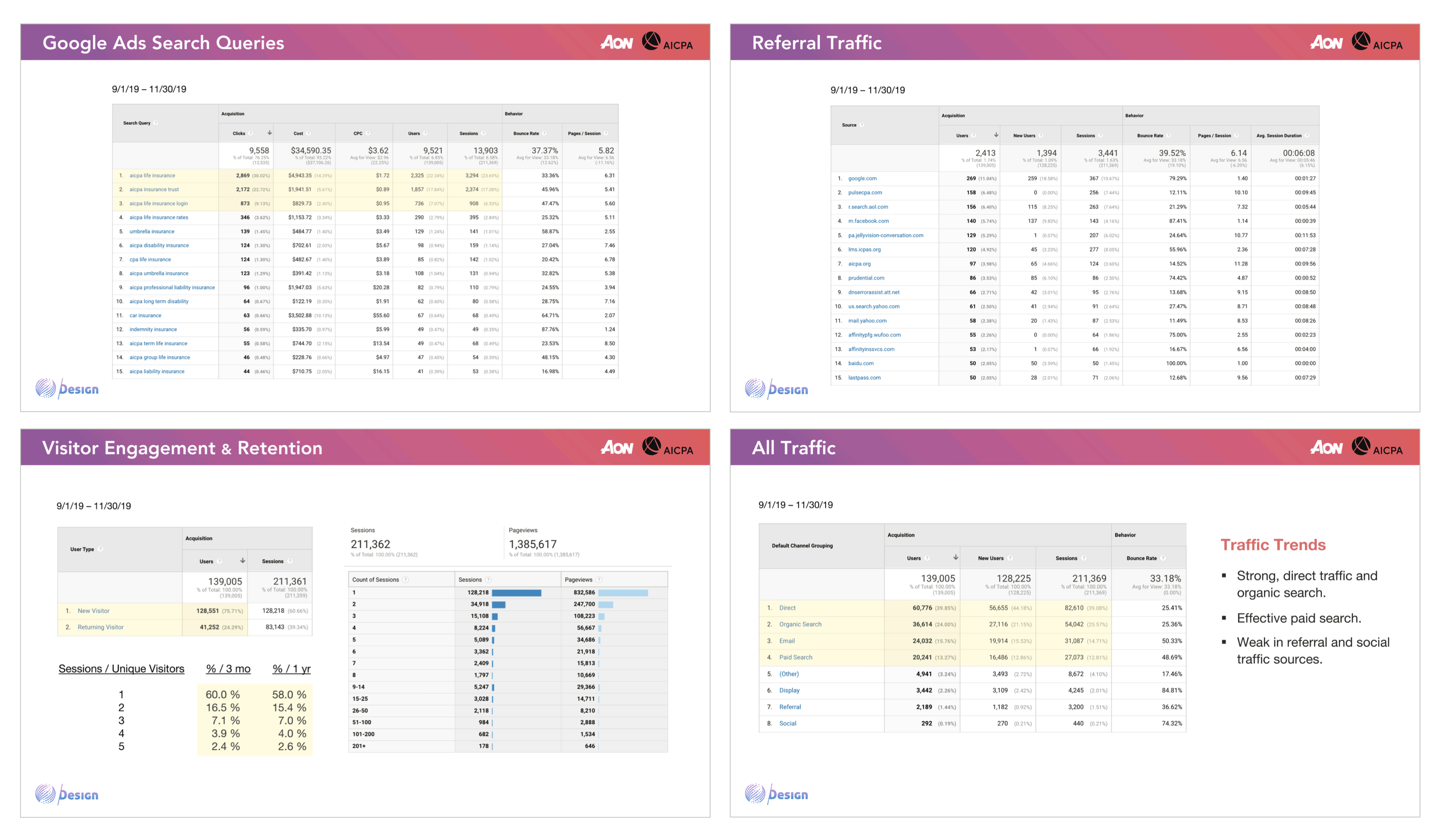
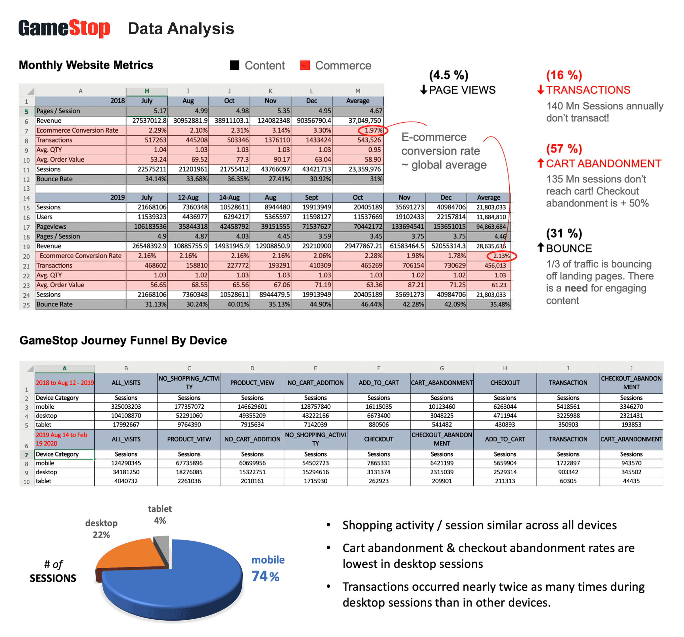
Similar to my work on heuristics analysis, I usually conduct analyses on whatever relevant data is available and provided to me. That may be Google Analytics, behavior flows, custom metrics, social media statistics, sales performance, etc. This assessment enables me to better identify underperforming KPIs, and potentially understand the causes. It also helps me determine immediate priorities to improve on or introduce specific features or functions to address performance gaps.
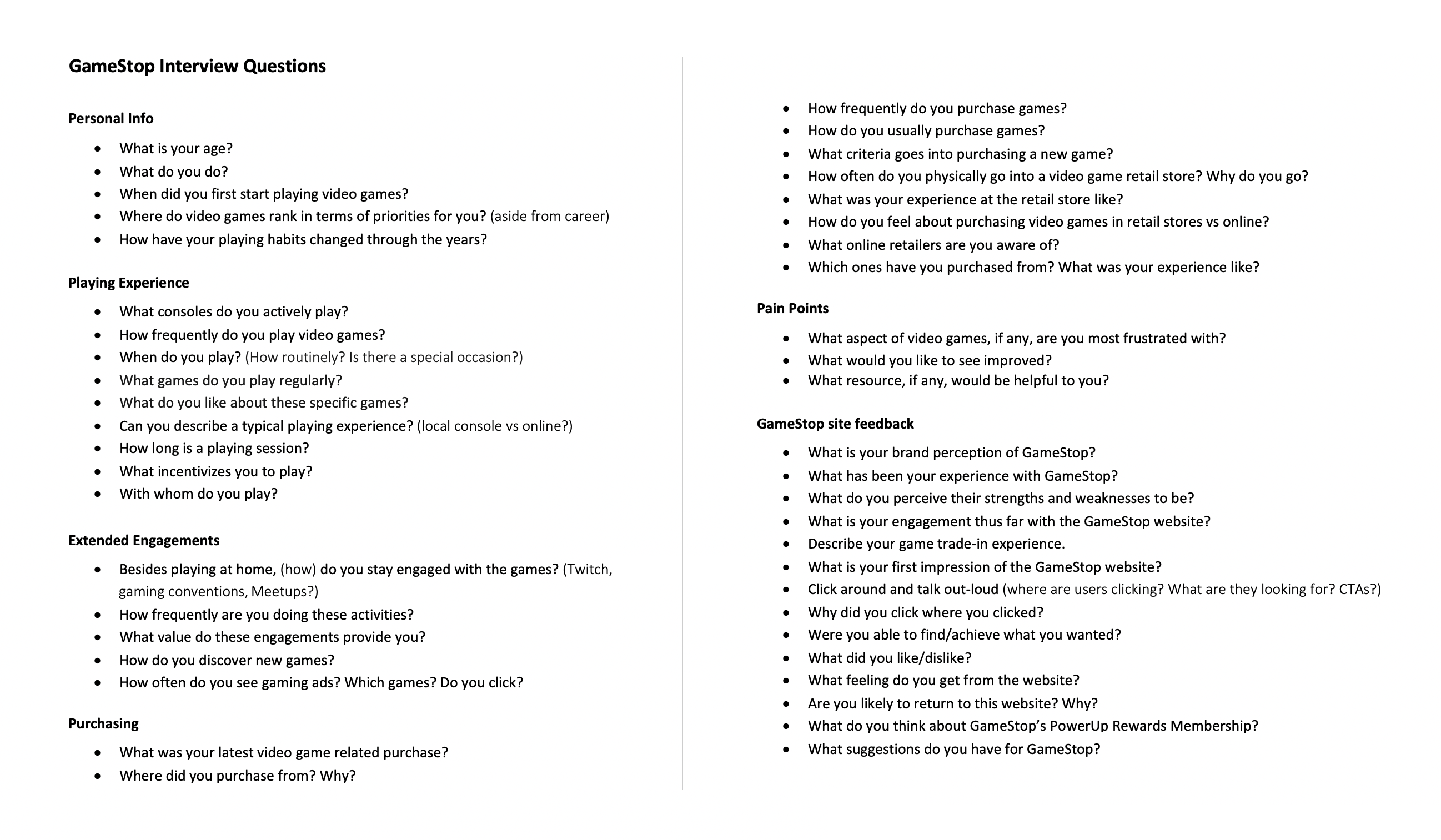
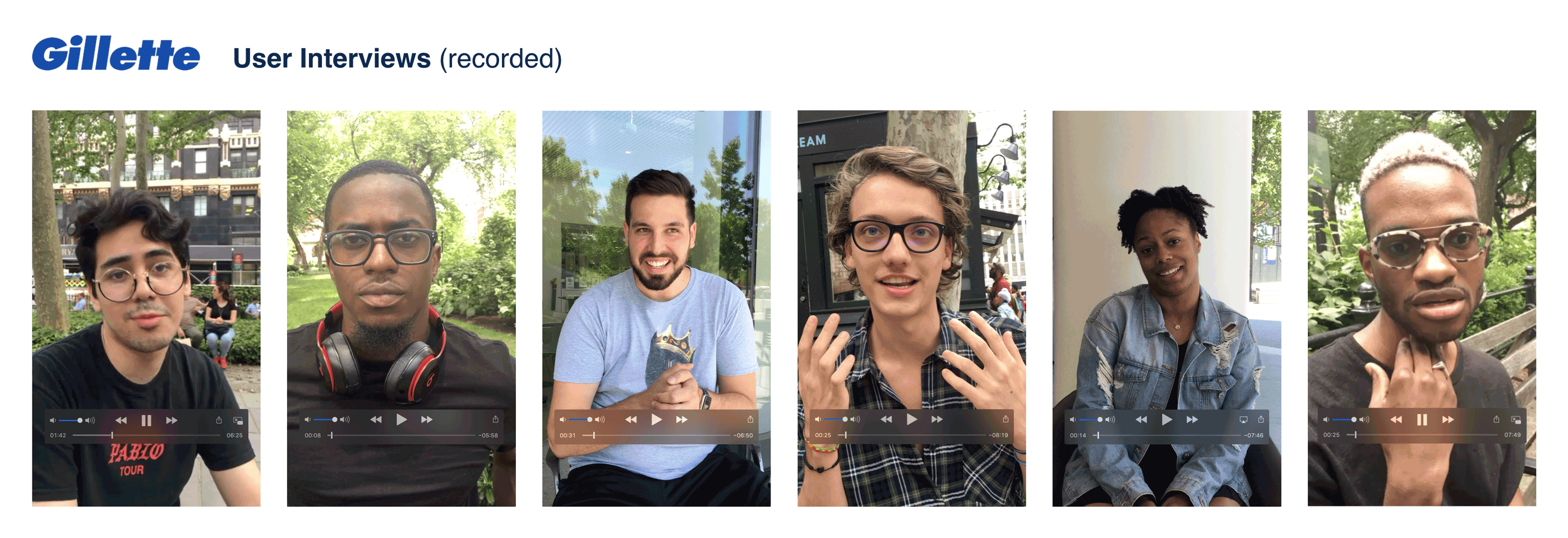
I enjoy the interview process greatly, and focus on understanding user psychology. I always begin asking broad questions about their daily activities, without specifying the reason or subject of our conversation. This prevents users from saying what they think I may want to hear; it enables candid responses. As the interview progresses, I will ask more targeted questions. If the users have not mentioned the company brand or product I am intending for them to talk about, I will ask about their familiarity and sentiment toward the said brands or products. I prepare an interview script, but am flexible to pivot if users lead me to other insightful directions. I record all interviews, usually with video, to capture non-verbal expressions and cues.
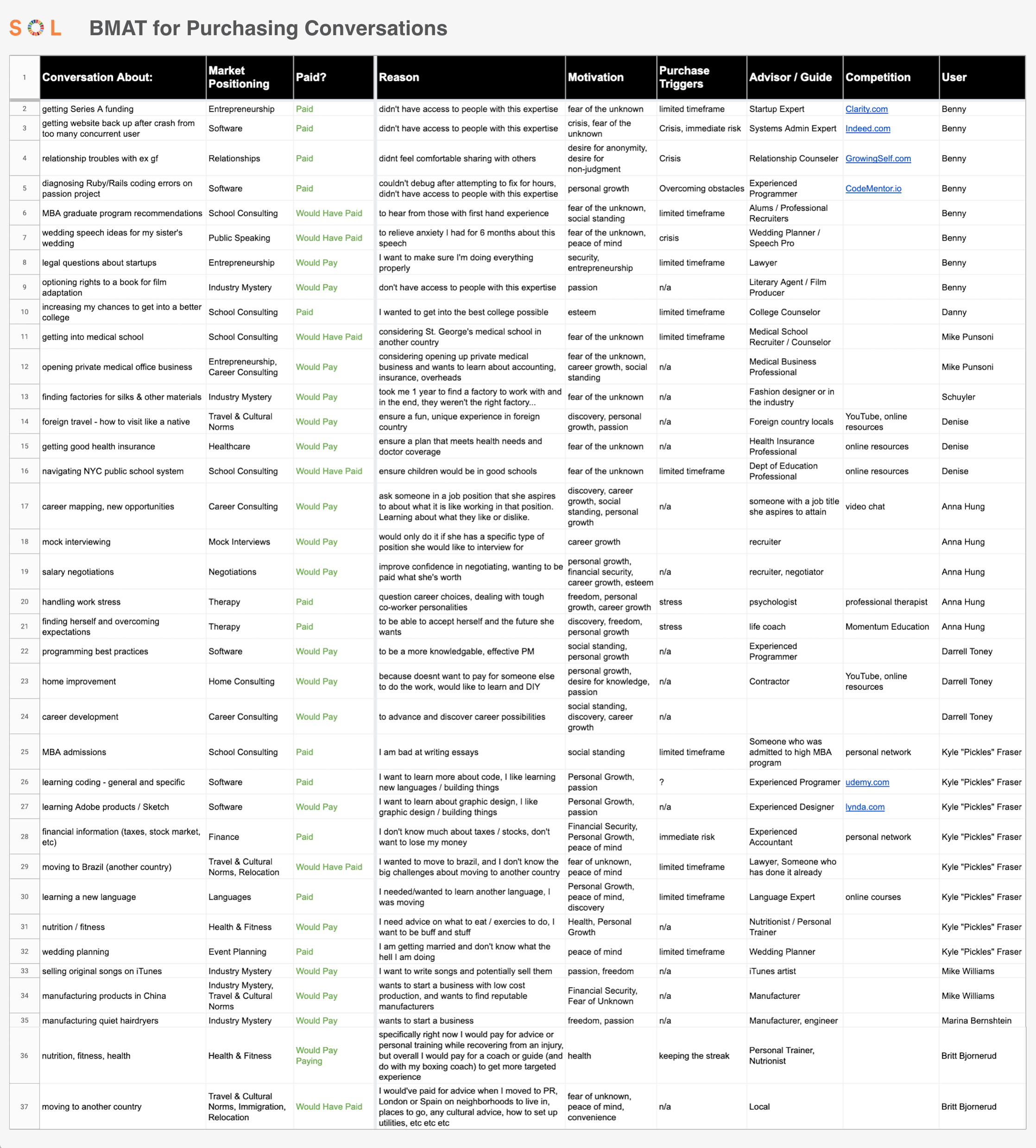
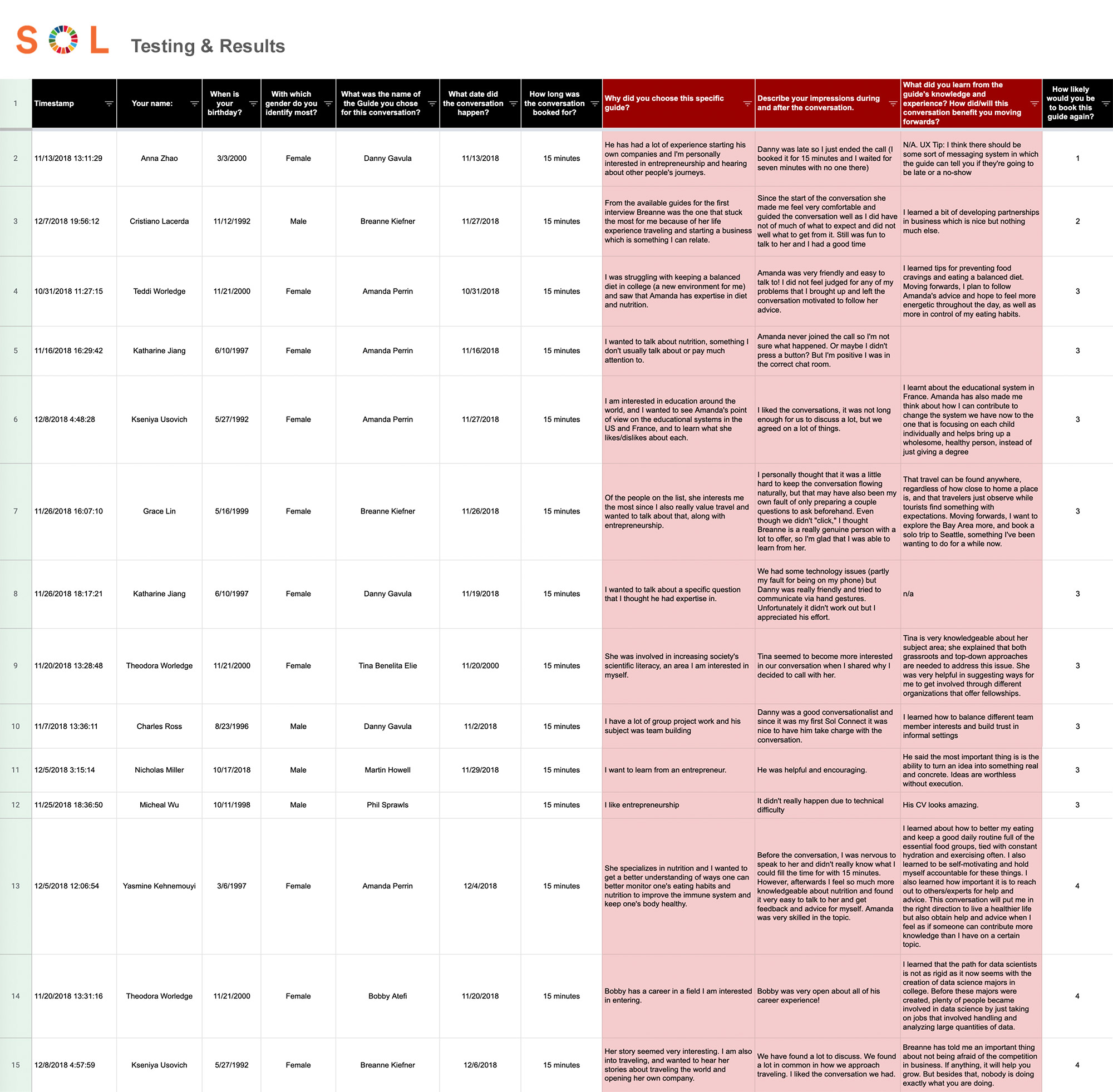
Stanford Professor Fogg's Behavior Model is one of my first considerations when assessing likelihoods of users achieving specific behaviors or call-to-actions. I believe long-term user behavior sustainability requires users to have genuine motivation to carry out the actions. When inherent motivation is low, triggers such as limited timeframe or discounts may compensate and encourage users to take action. Below is my documentation of different motivations and triggers contributing to users purchasing 1-on-1 sessions with mentors in various subject matters (SOL project). This enabled my team to identify recurring reasons, themes or subject matter by which we were able to better define SOL value propositions and offerings.
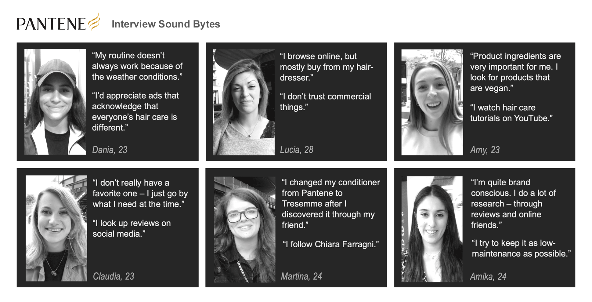
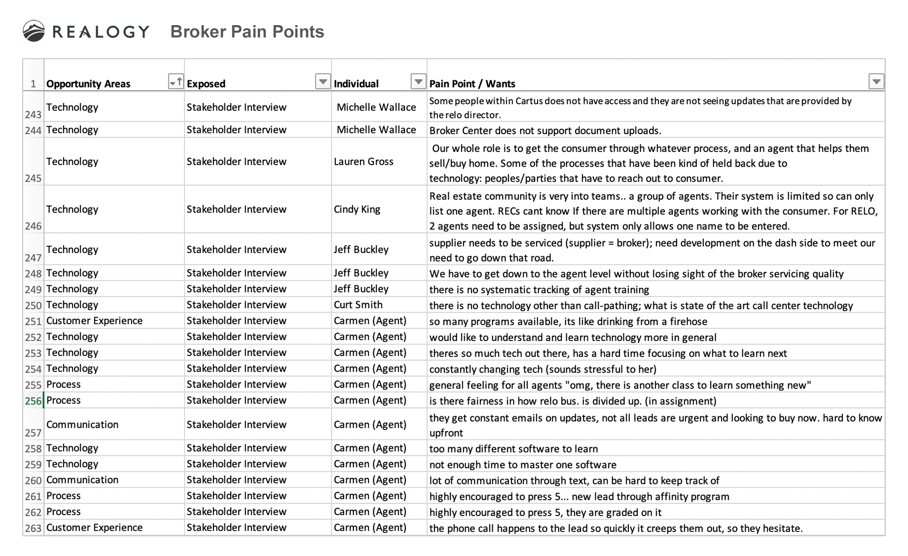
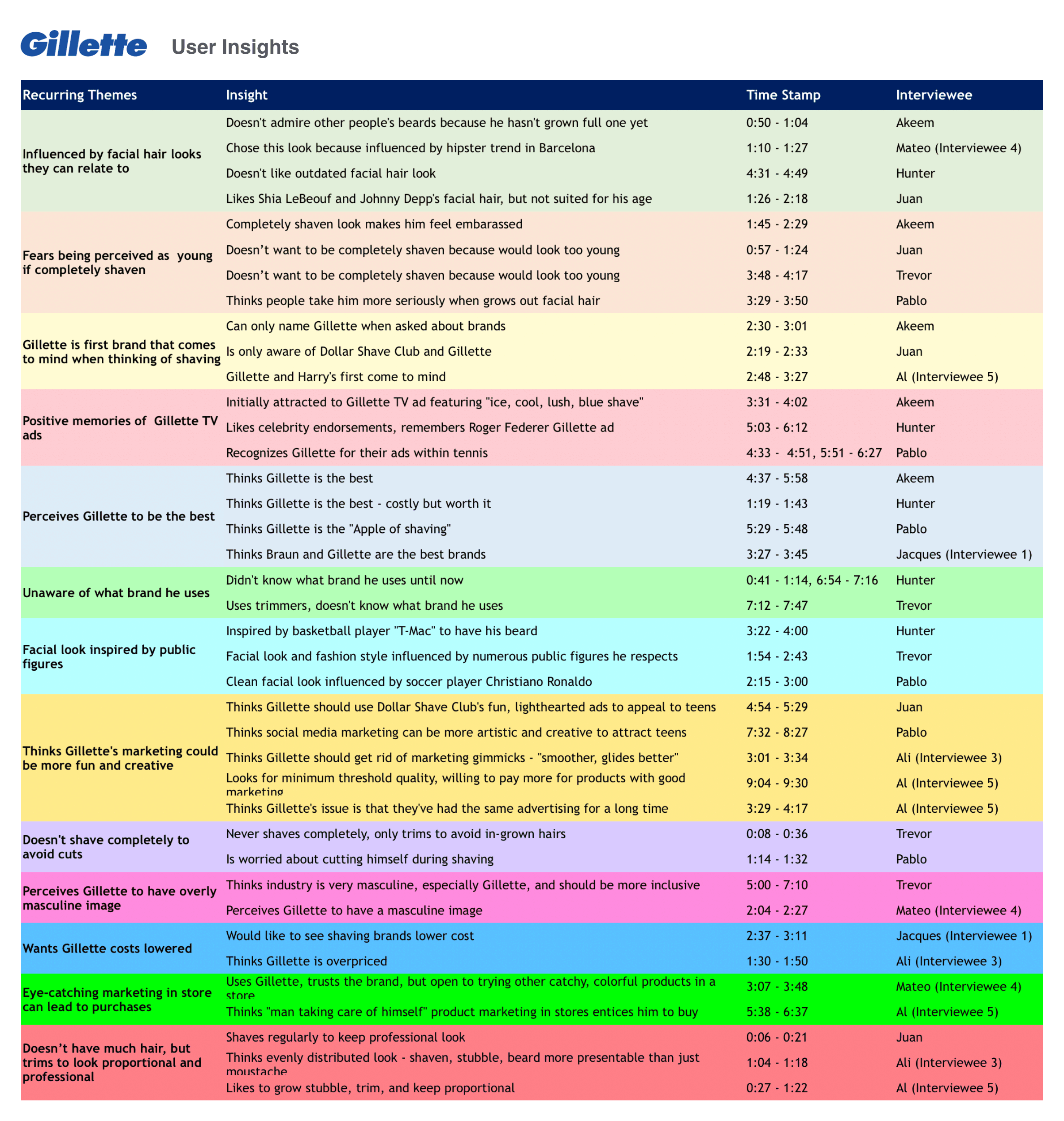
After interviews, I look forward to grouping pain points, tendencies, and other knowledge acquired from users. The pain points spreadsheet (example shown below - created by my Mindtree colleague Melissa) is front and center in my design process. This user feedback as a whole enables me to extract unspoken insights, providing me with opportunities to ideate on solutions. From my interviews, I like to extract insights and recurring themes, as shown in my Gillette project (below). This enables me to identify new opportunities and solutions.
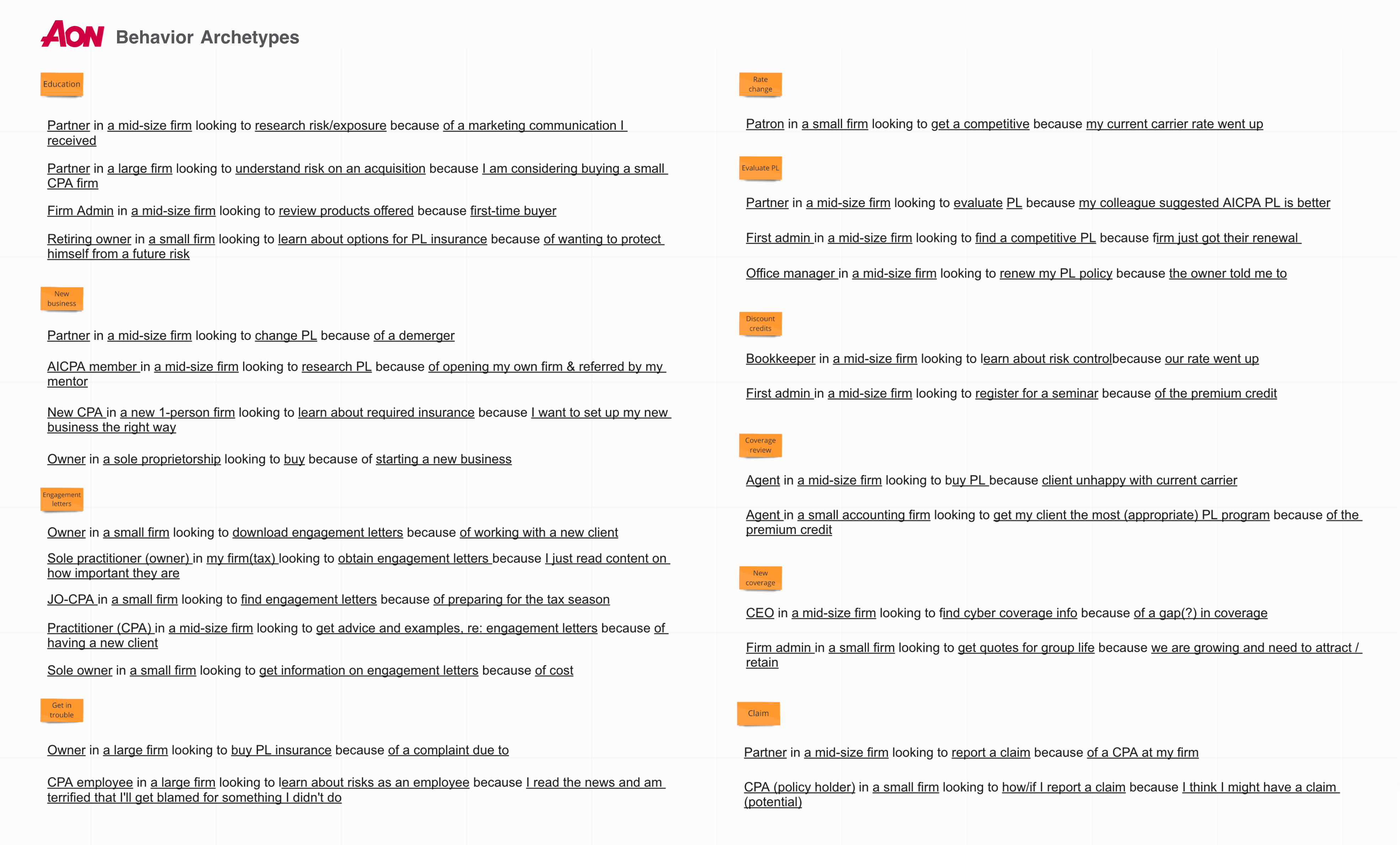
While personas are critical in my research process, I also like to identify "who is doing what, how, with whom, and when?" This enables me to identify critical workflows, reasons for why users are achieving CTAs (and when they are not), and other contextual information. This exercise forms the basis of user segmentation and potentially serving personalized content when deemed appropriate.
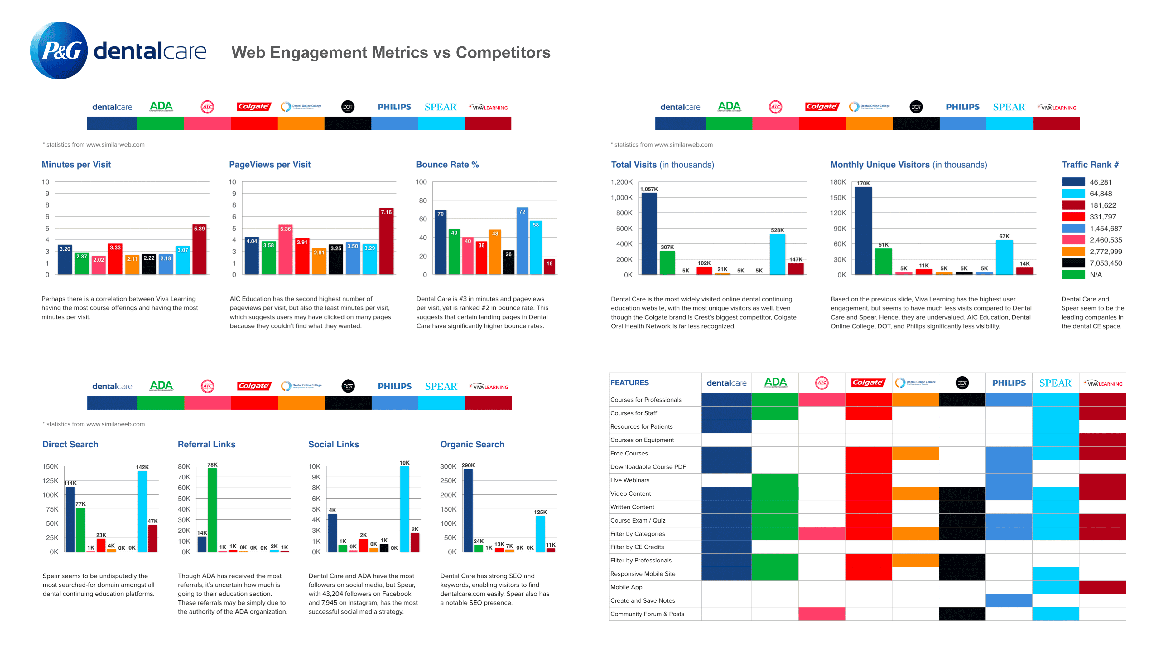
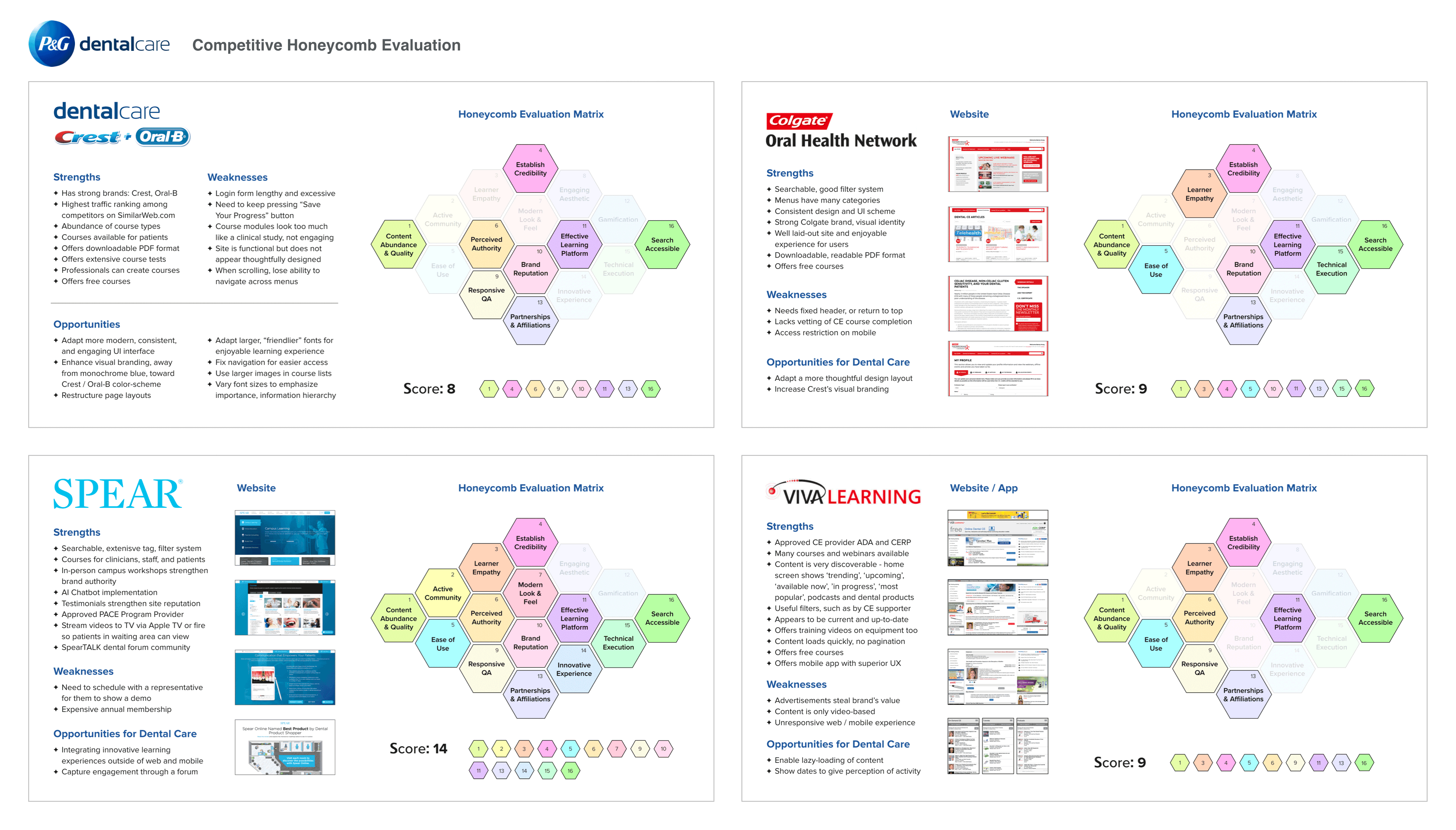
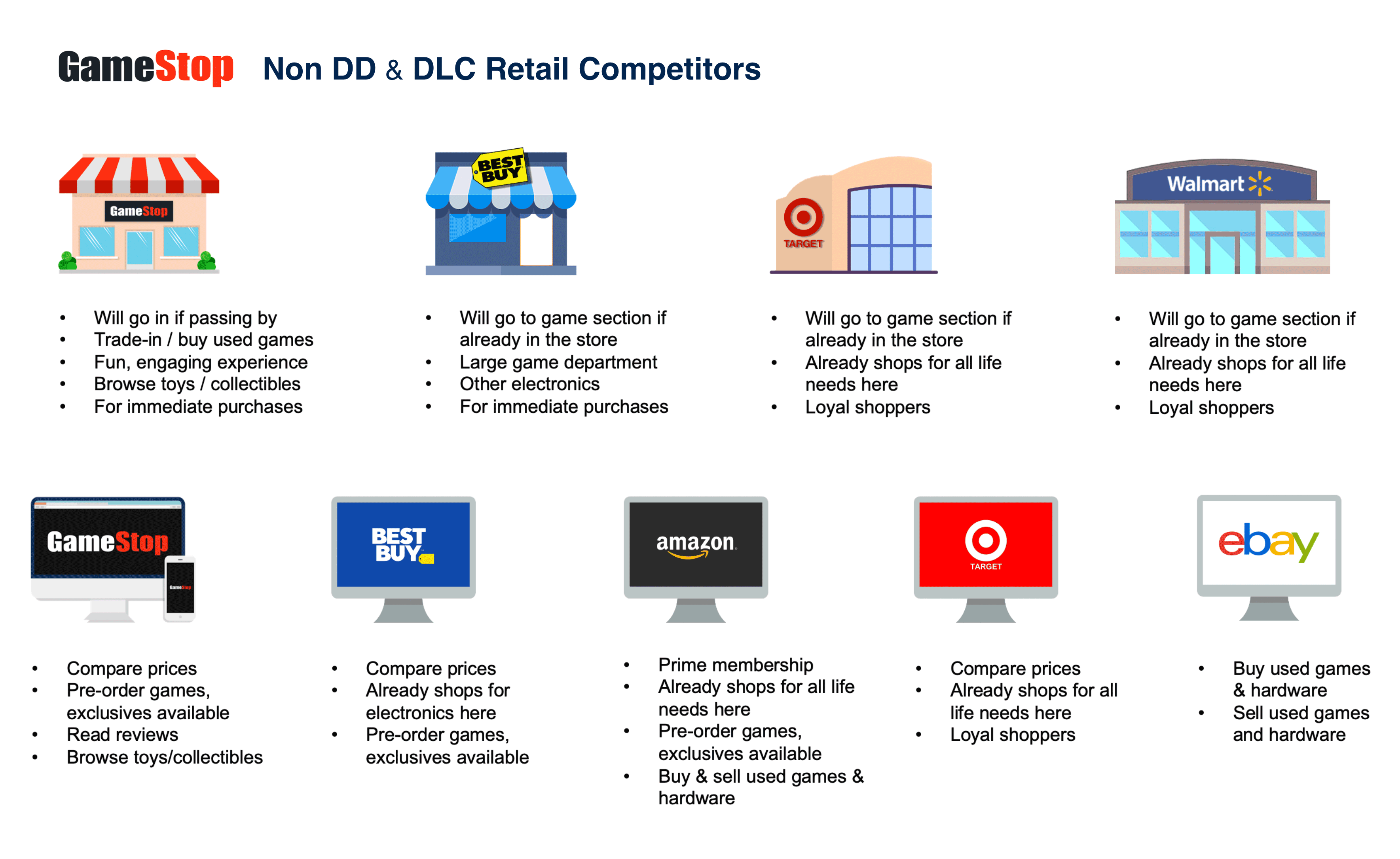
Competitive analysis exists on many levels - ranging from engagement metrics, brand perception, heuristics analyses, product offerings, target audiences, pricing, to market positioning, etc. Below are examples detailing my various assessments of client competitors.
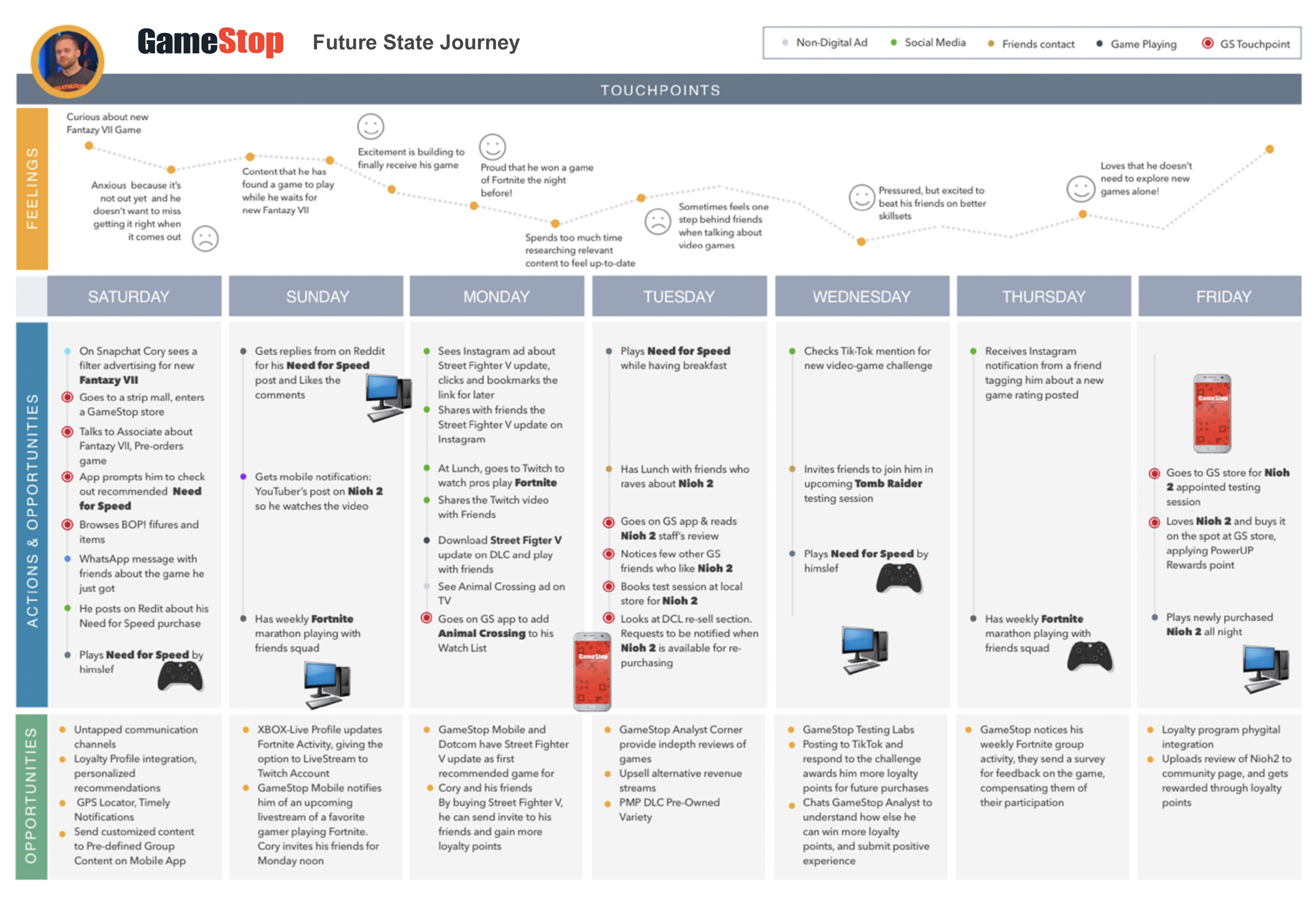
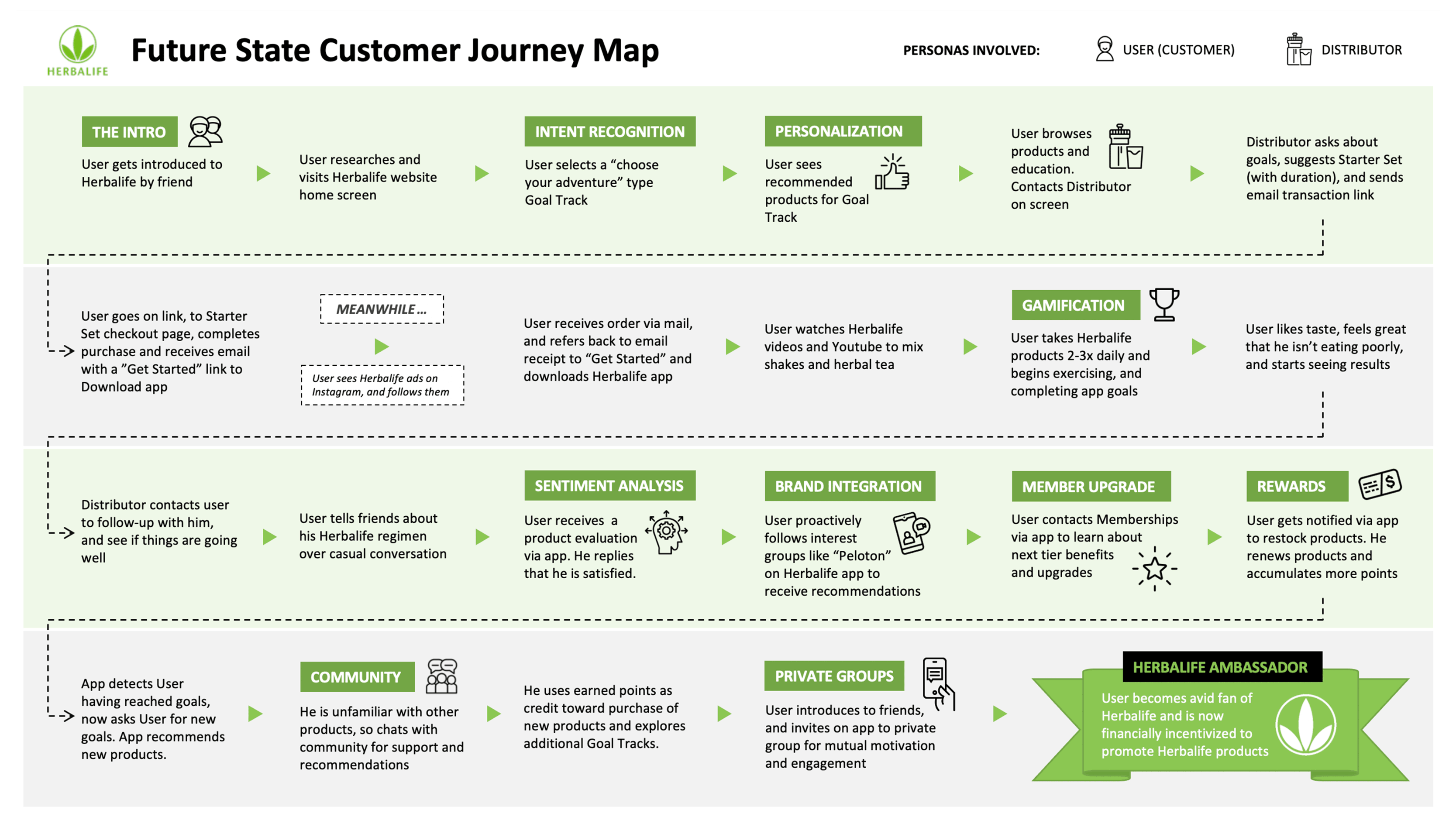
Journey mapping is one of my favorite exercises - I compare it to a detective scene in a movie, where they gather around a board with pinned photos of crimes scenes, suspects, and strings of evidence trails. This is similar to the journey I am recreating or "piecing a puzzle" - what is a user's current experience? Mapping current journeys help expose inefficiences, potential gaps, user sentiment at each stage, and potential opportunities for experience enhancement or innovation. I create future journeys, with examples shown below (done with another visual designer), to plot a macro view and holistic new experiences, addressing ecosystem and external touchpoints.
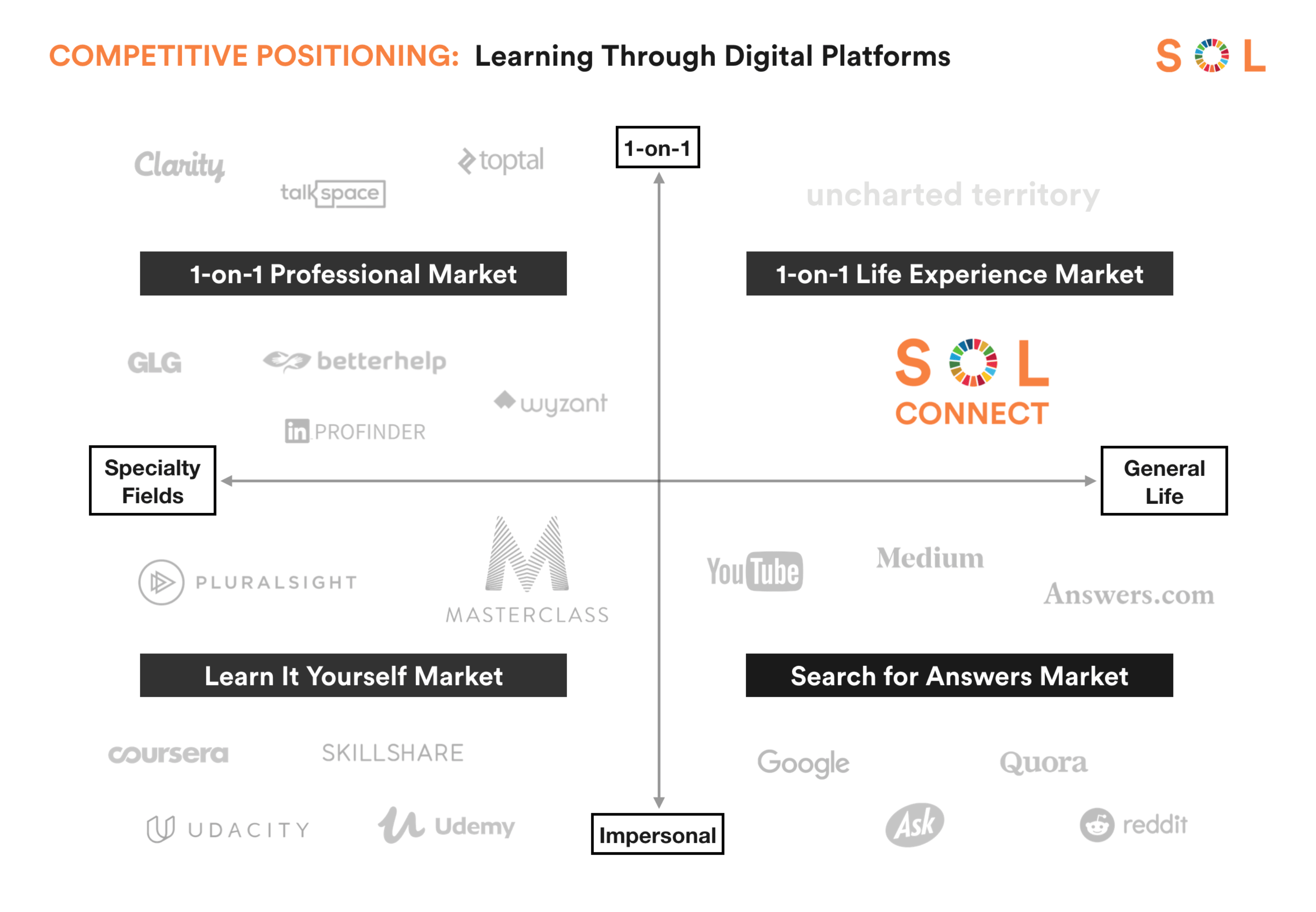
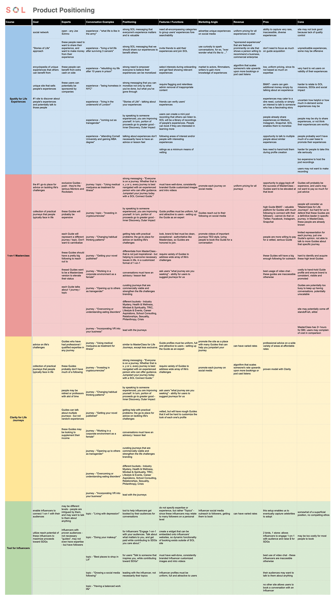
Often times, I do not decide upfront what our product's positioning will be. Rather, through the design thinking process of solutioning for user needs and stakeholder goals, the said product's position emerges. There may be various options, as I have shown below, in my analysis for SOL project. Here, I considered different potential offering and revenue models for users to subscribe to, based on prior BMAT, pain points, and insights analyses.
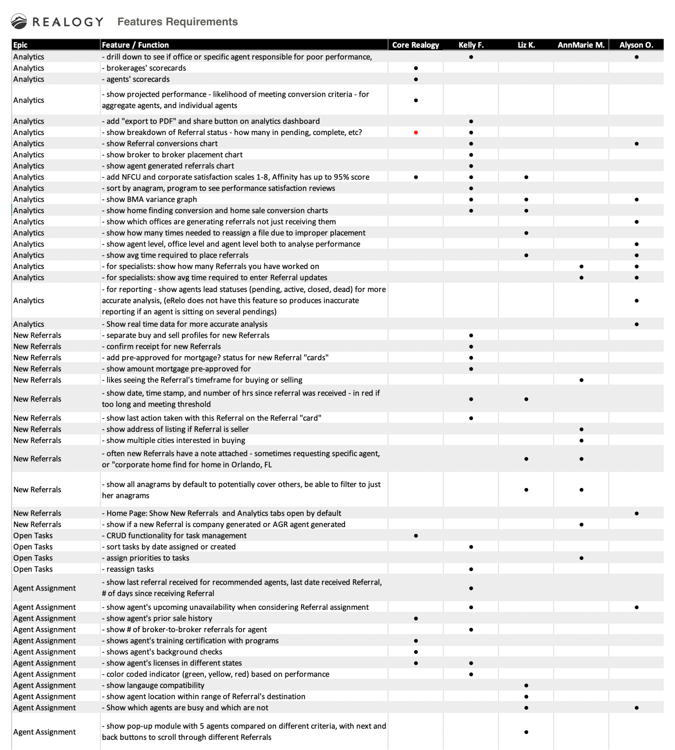
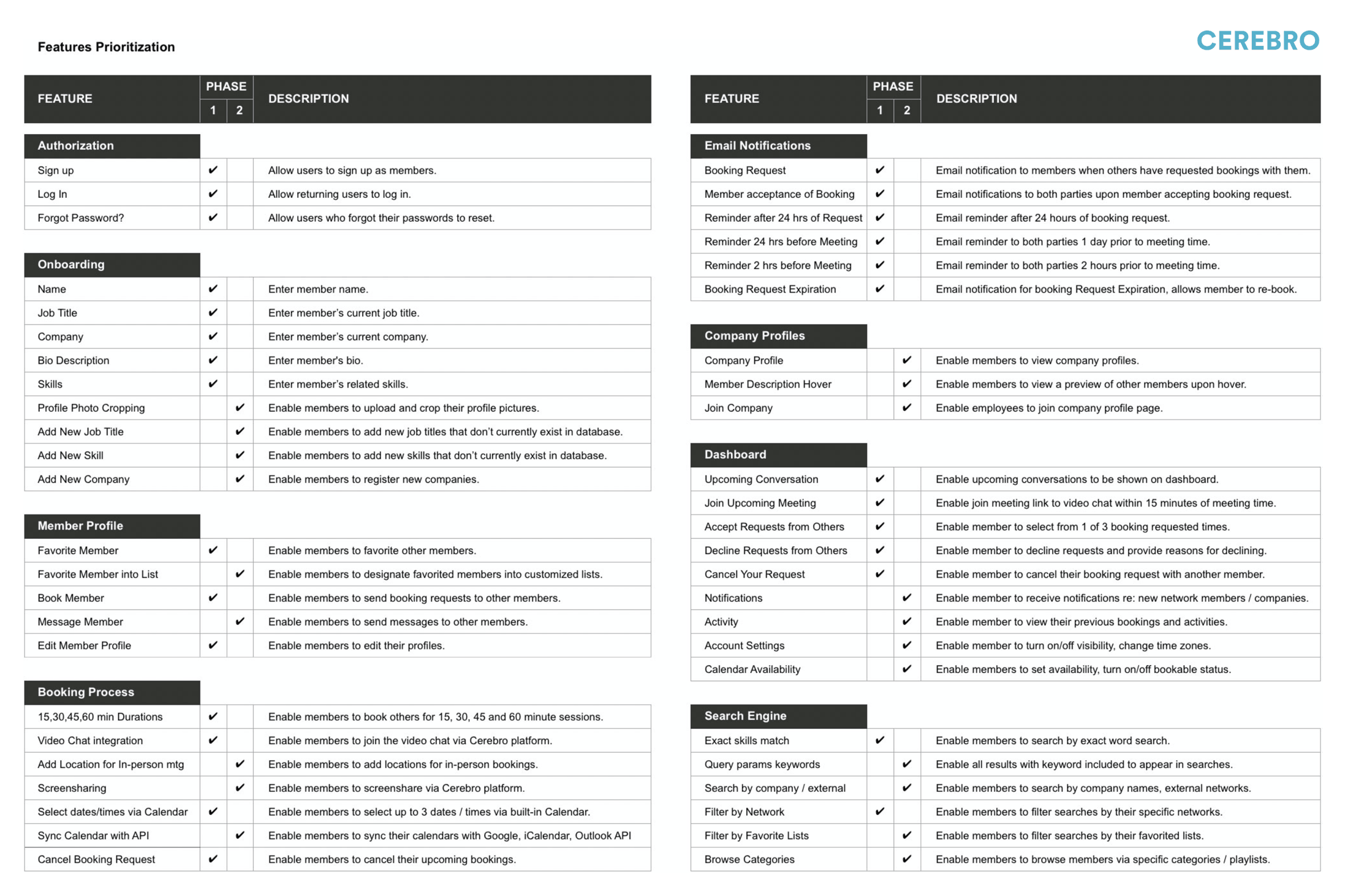
After deciding on the product position, details from the future state journey and pain points documentation contribute to a features list. I often work with a PM to prioritize MVP scope and roadmap phases for these features and functions. Usually my PM owns this document, but as shown below, I have also created features requirements to lead design teams, and ensure prototypes convey the comprehensive, desired experiences.
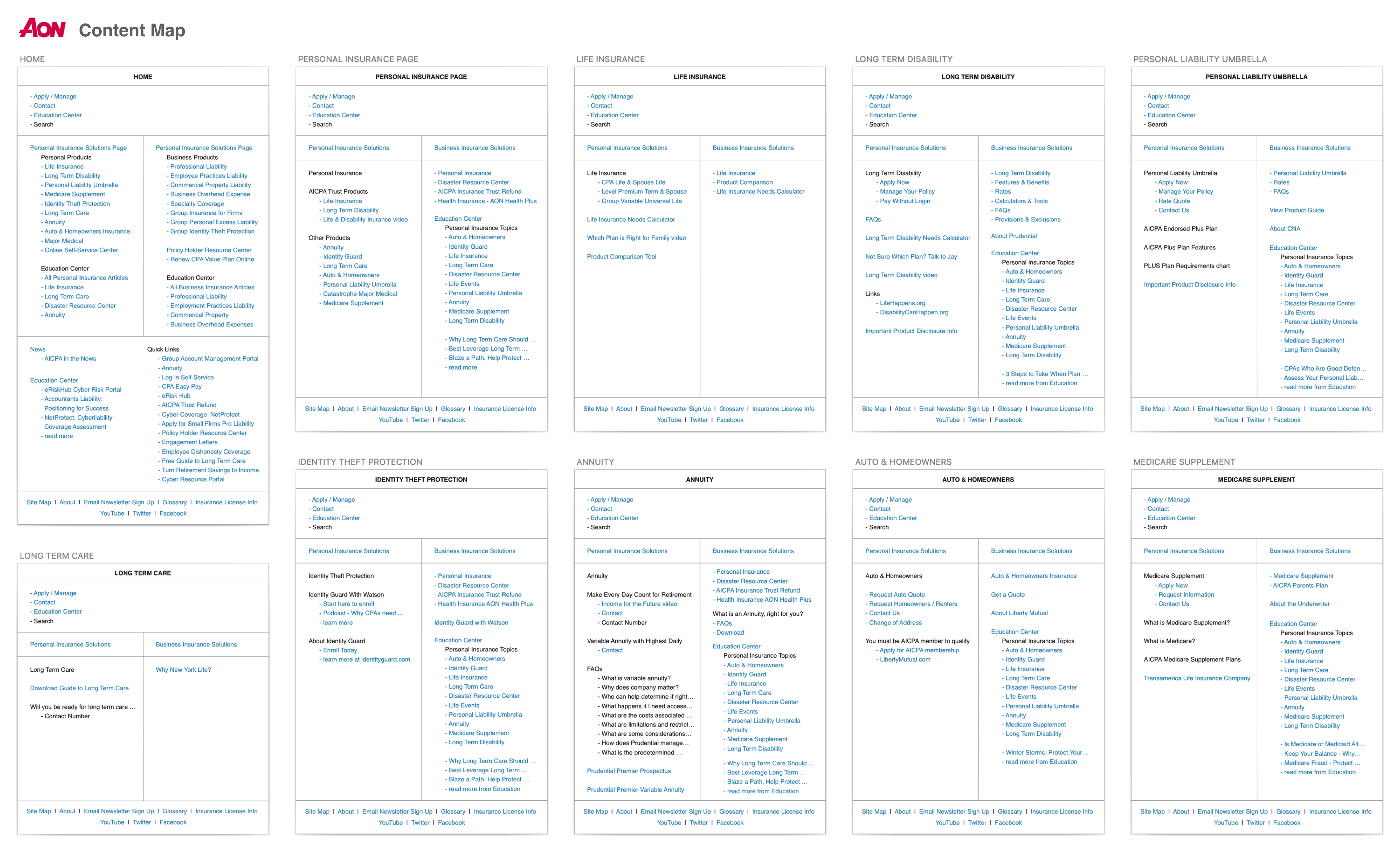
Immediately following features requirements documentation, I like to create content maps. Imagine you are designing your dream home. Before drafting your living room, master bedroom, or library, it would be helpful to know what items you intend to station in each room. Does the grand piano go in the living room or the family room? Content maps, as shown in my examples below, merely show a list of required content or features that need to be accessible on each screen. Once we know all the content, links and features on each screen, I can create intuitive and easy-to-navigate workflows via wireframes.
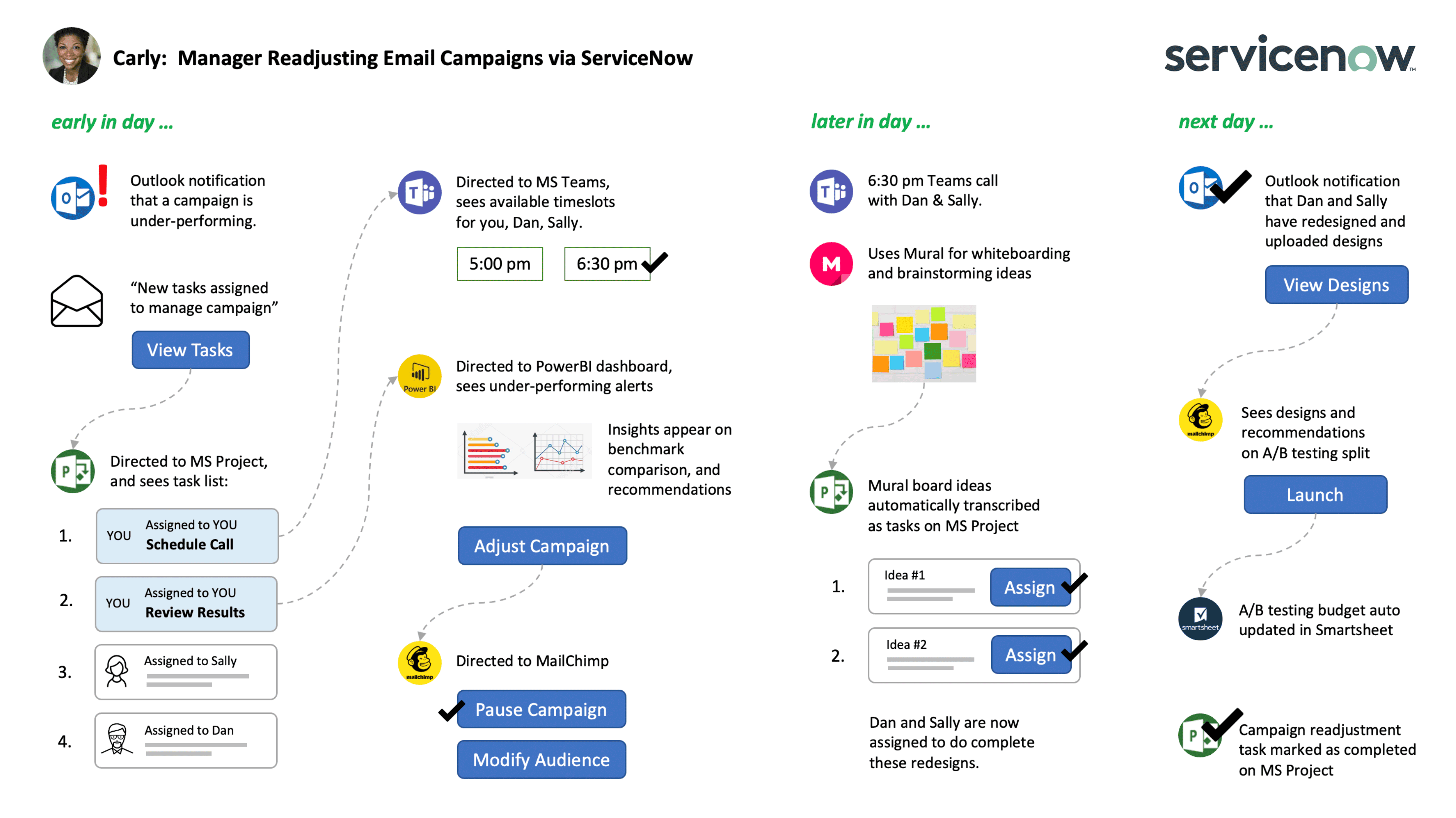
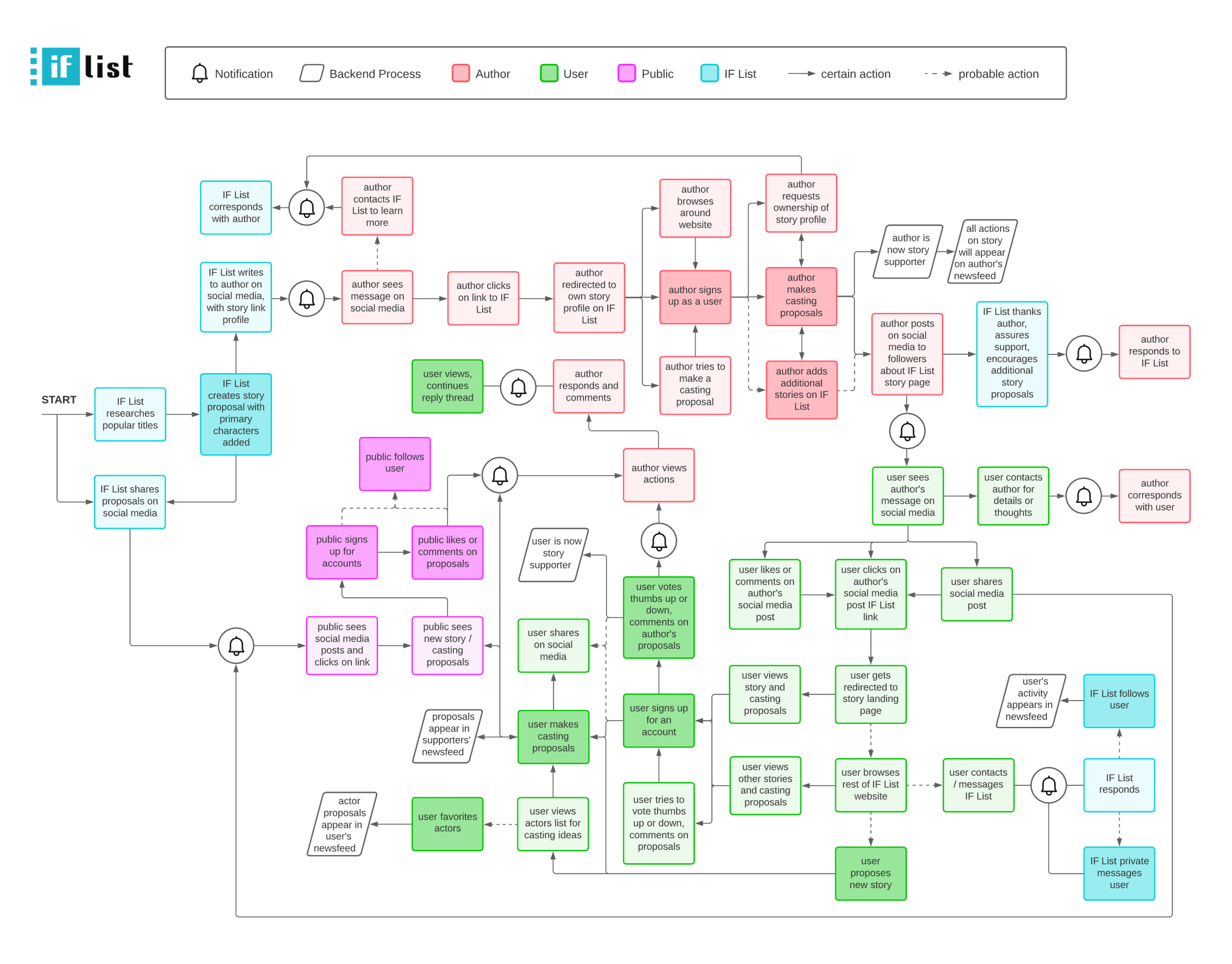
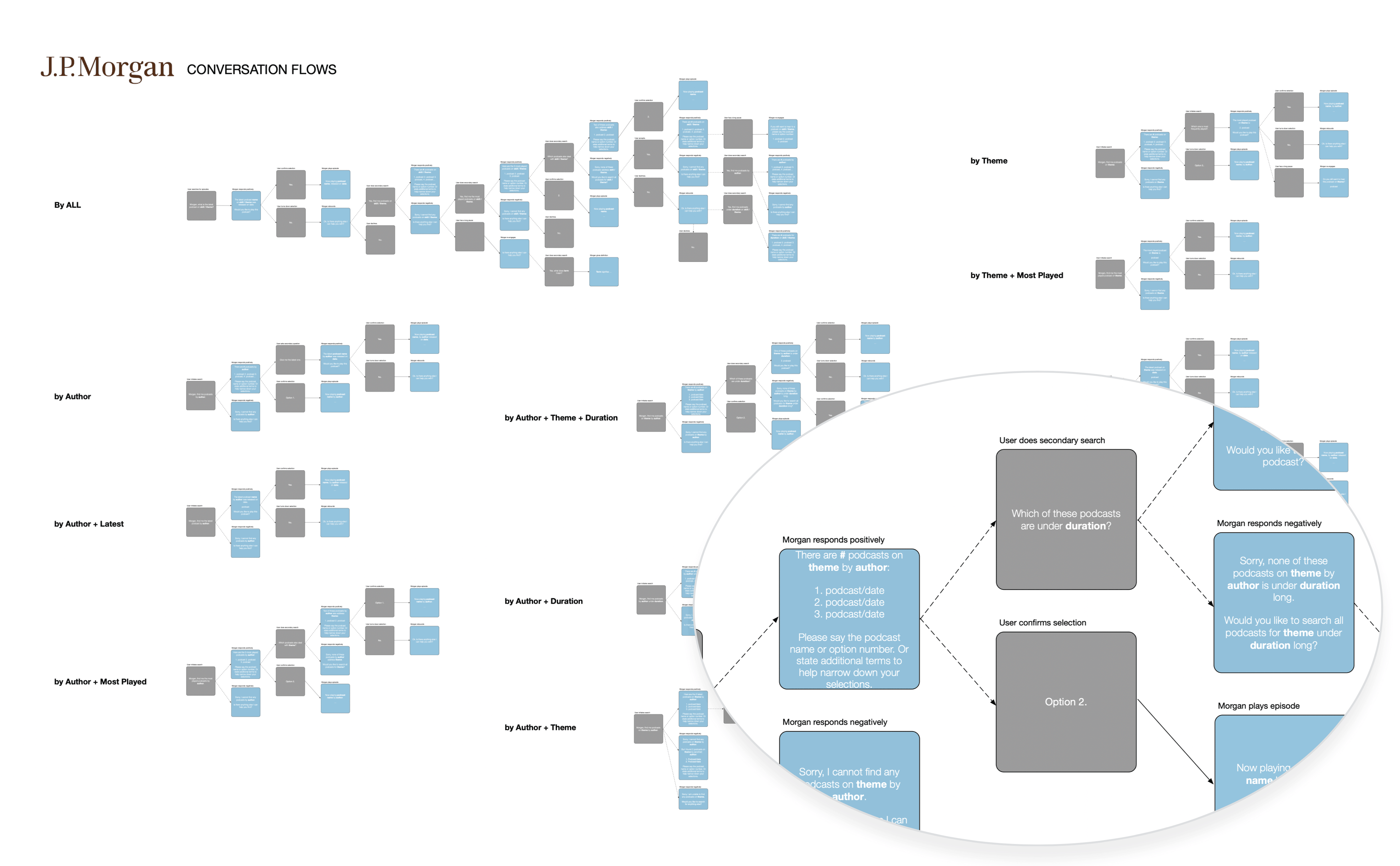
Process mapping is one of my favorite exercises, as it complements the flow of content served to users. I like focusing on process prior to visual design because it helps me construct the soul and operations of a website, app or software. What happens when users create an account? Even non-client-interface actions need to be accounted for, as it dictates how data is persisted throughout a platform, and how users may receive notifications, etc. I particularly enjoy process mapping because it relates to my background as a back-end developer. Identifying different conditions or combinations of user inputs (as shown below in my JP Morgan conversation design example) enables me to design for all situations or states. Process mapping also segues perfectly into my next consideration: information architecture.
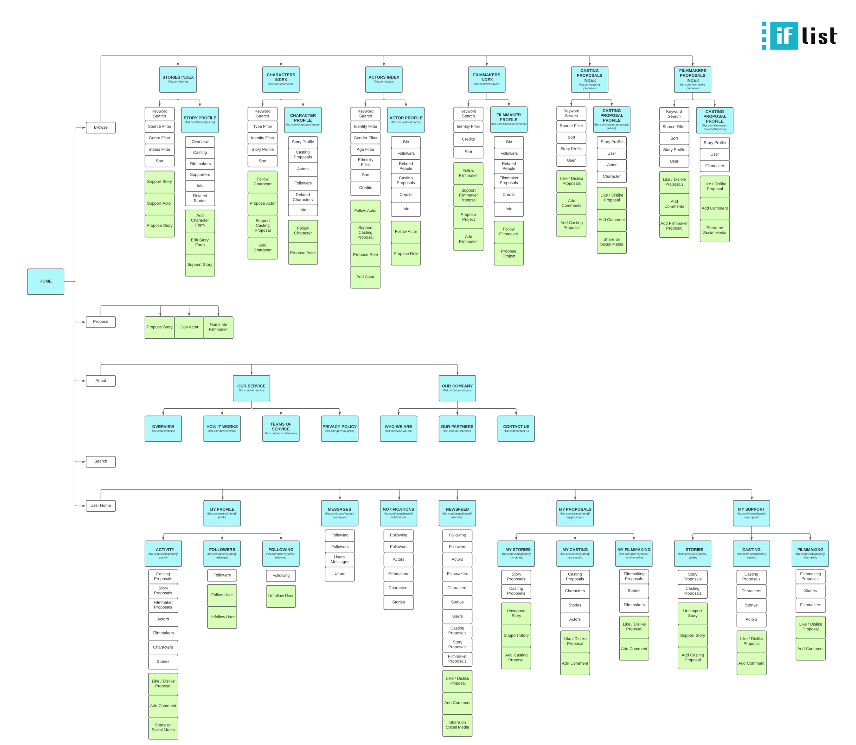
This is probably my favorite aspect of UX design. At this stage, I know what screens are needed, what content is required on each screen, and how workflows need to be setup. But how can I tie it all together into an intuitive, easily navigable, and sustainable site? What is the hierarchy of information? What content or features need to be displayed on default, and which ones can be hidden, only to be revealed in specific states? Drawing from my undergraduate days as an architecture student, I see many parallels to the process an architect undertakes to arrange spaces, and I appreciate and always look forward to this challenge.
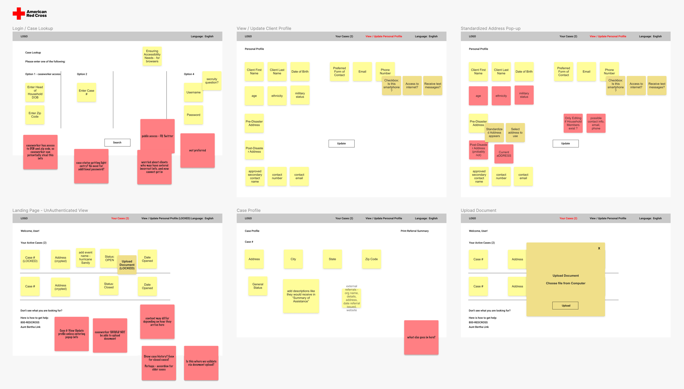
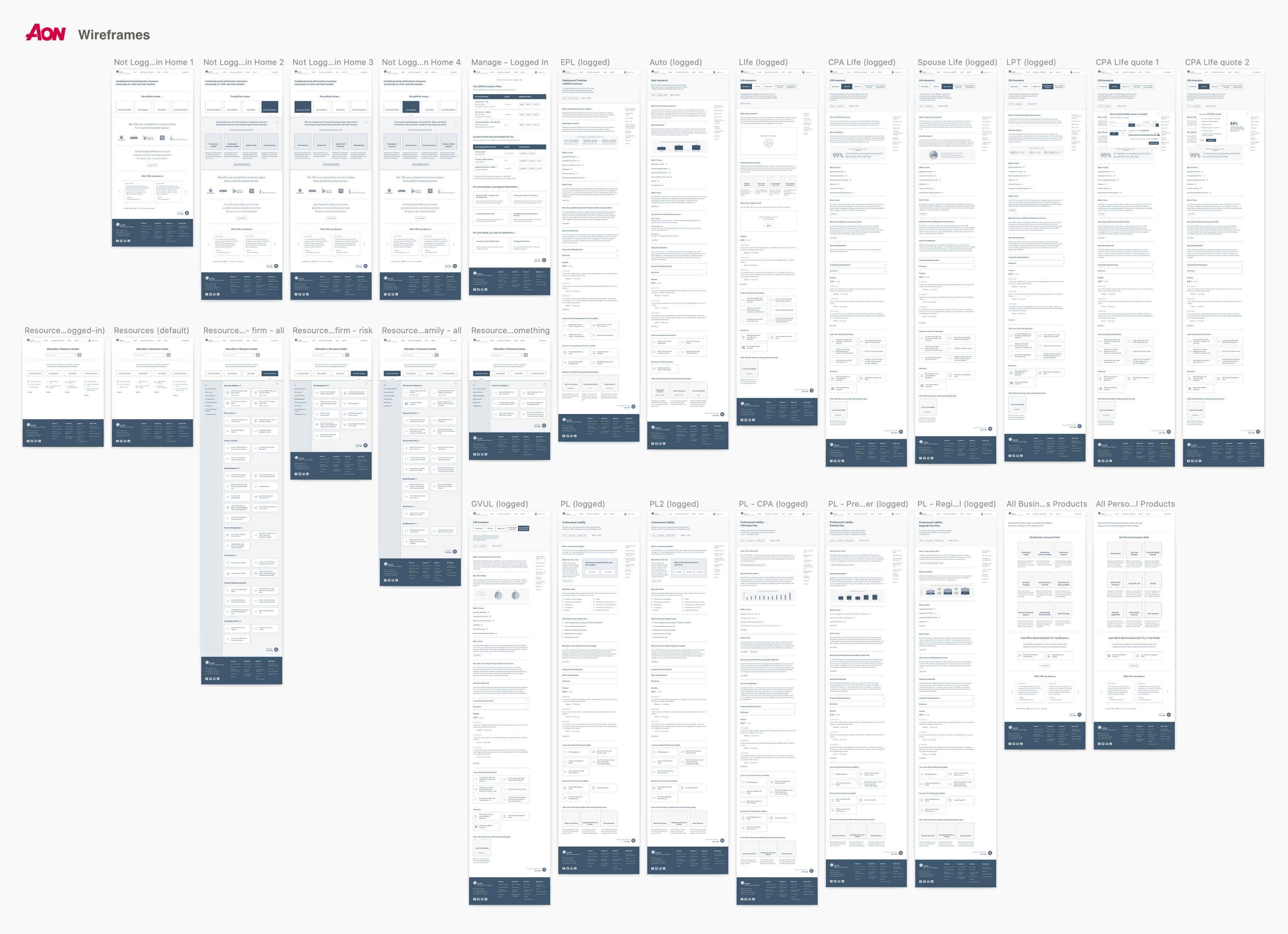
I often quickly execute a drawing or sketch to capture ideas before forgetting them. However, I rely on creating wireframes for actual planning. Sketches lack a reference scale, and do not have fidelity in terms of how much content can be displayed at certain browser width break points. Even in low-fidelity wireframes, I like to be fairly detailed in my font size, image placeholder proportions and content spacing, to realistically determine if design layouts are feasible. I also like to use few shades of color and font-sizes to differentiate text, buttons and links. Even my low-fidelity wireframes, as shown below, have clickable prototype interactions to test out navigation and workflows.
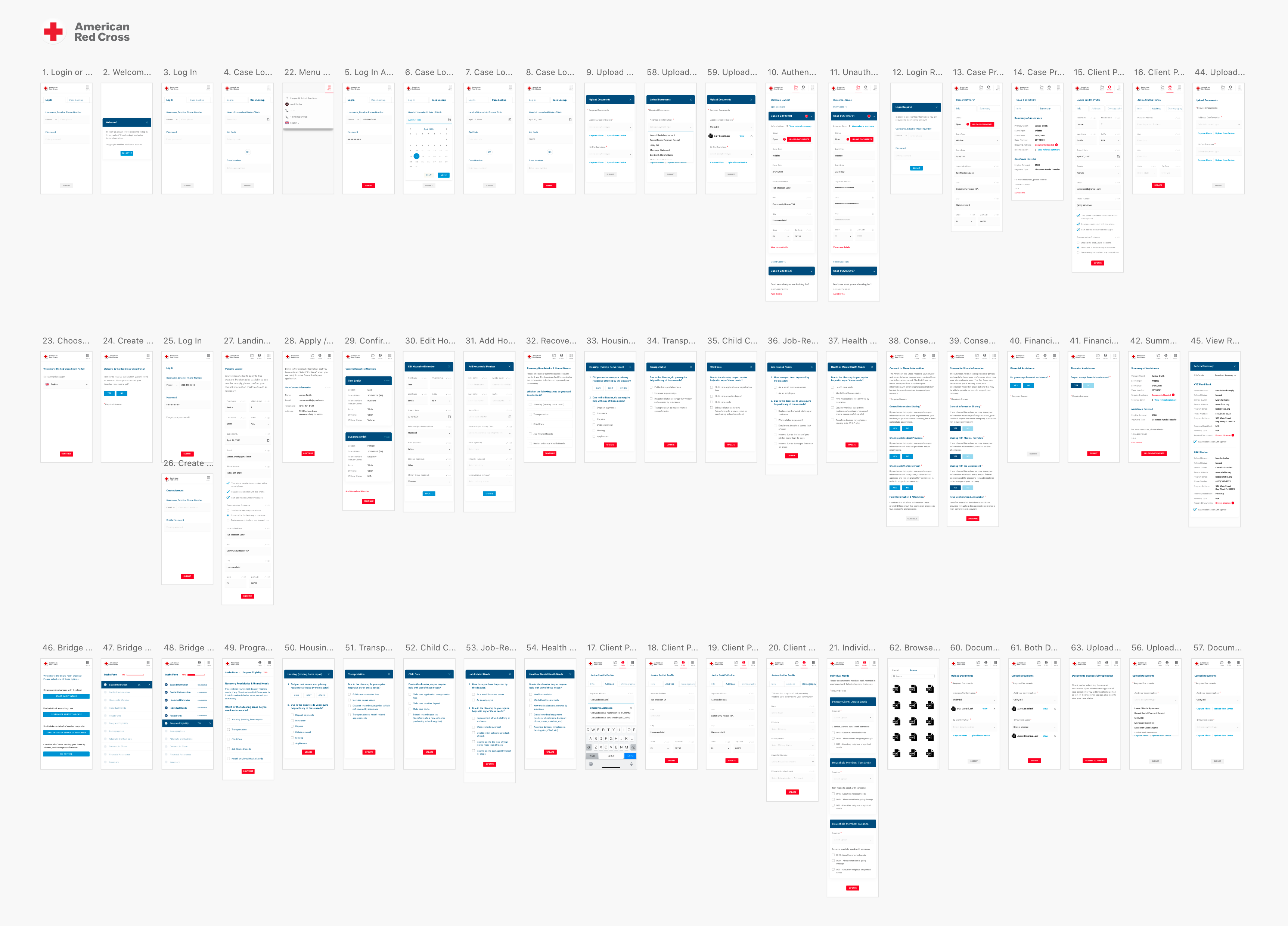
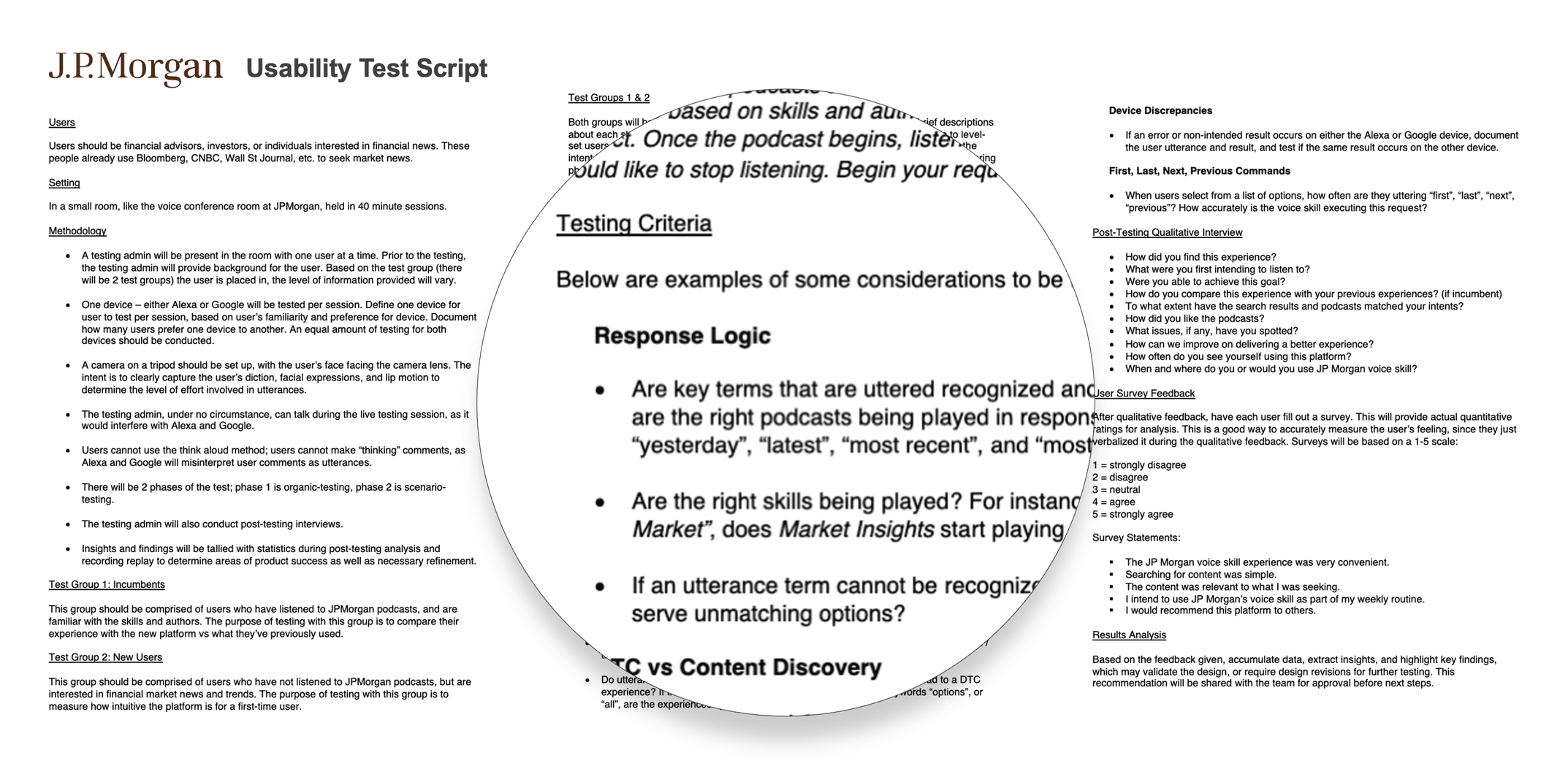
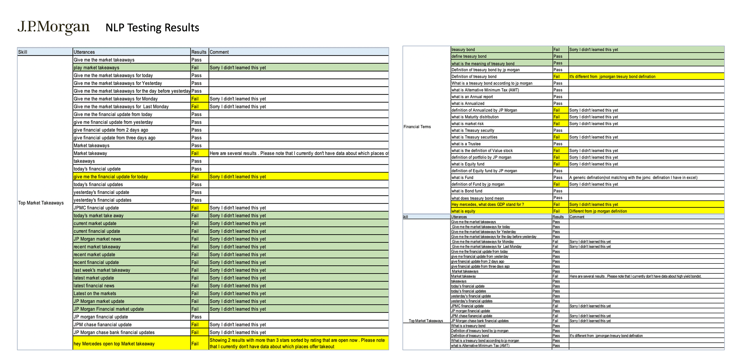
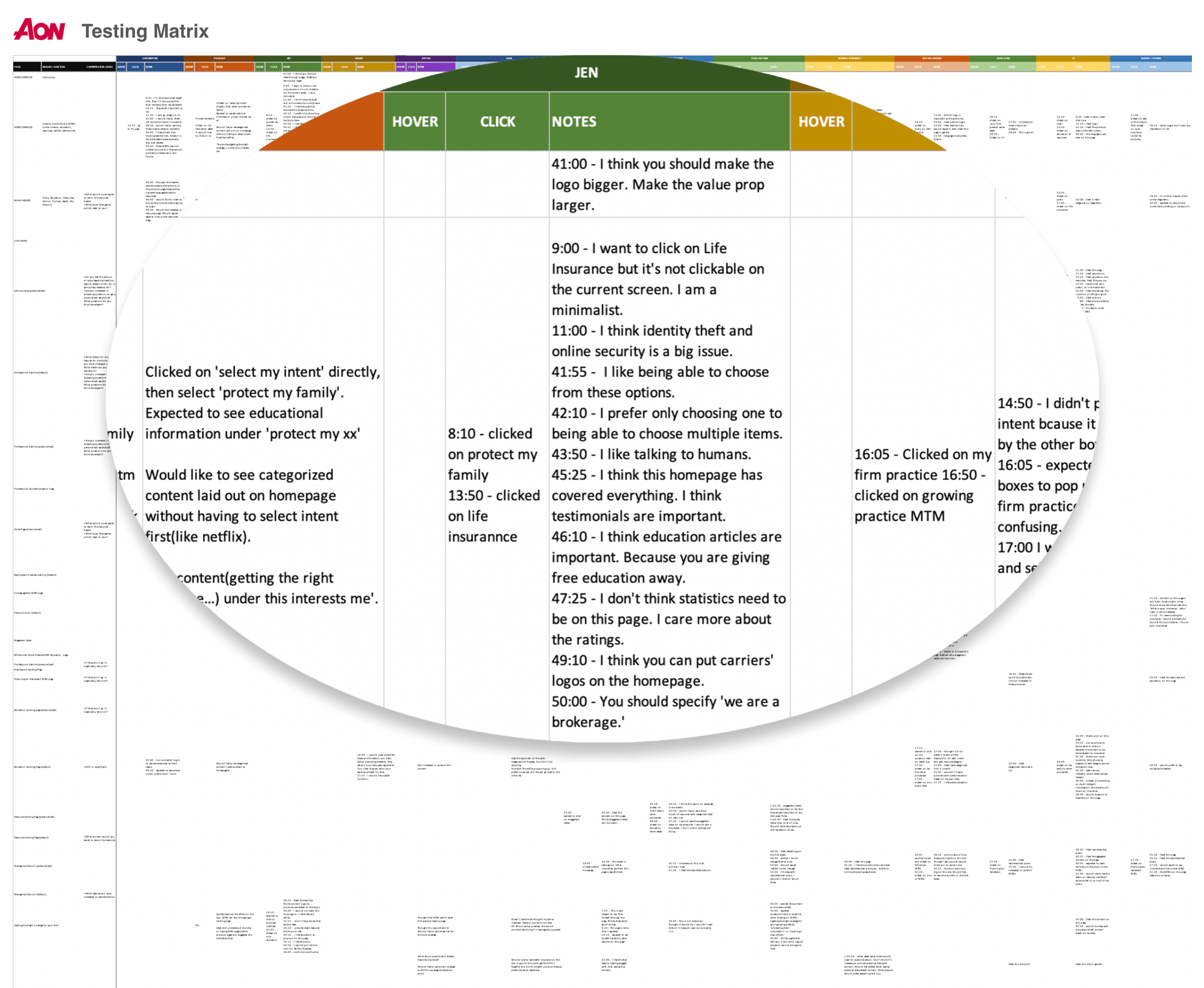
A believer in the agile sprint approach, I am often designing and quickly receiving feedback from users and stakeholders on a daily basis. Thus, over a period of time, the prototype is ever-evolving. The first part of usability testing is determining what I want users to do during the session. I always have a testing script prepared (an example of my testing script for JP Morgan is shown below) - almost like a checklist. Will I be moderating and asking them to complete certain workflows, or will I merely observe and study what they click on first, and how they navigate throughout the site? I employ a combination of both, encouraging testers to talk out loud, so I can understand their thoughts and feelings at any given time. I also ask that testers do not try to go through the entire prototype, as that is unlikely in their actual day-to-day experience. I want them to engage in the workflows that matter to them, so that I can view an authentic simulation of their behavior. While I conduct these sessions, I often rely on another designer to document findings. I design results spreadsheets with relevant input fields (as shown below) for testing data to be captured. The insights gathered enable me to iterate until stakeholders and users feel that we have arrived at an optimal solution. At this point, I am ready to begin high-fidelity prototyping, as shown in the Prototypes section.
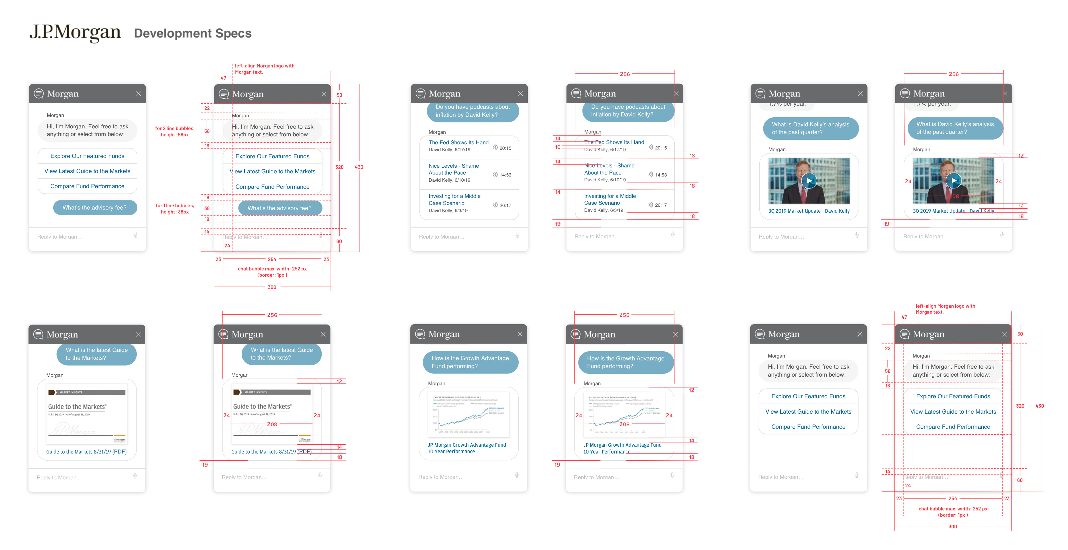
In addition to using design specification tools such as Zeplin, Invision, or XD and Figma's native CSS inspection feature, I sometimes provide further documentation for developers, as shown below, to ensure clarity.